WeHo Pride
EXEC. CREATIVE DIRECTOR & HEAD OF BRAND
Identity, Design, Marketing, Social, Merchandise
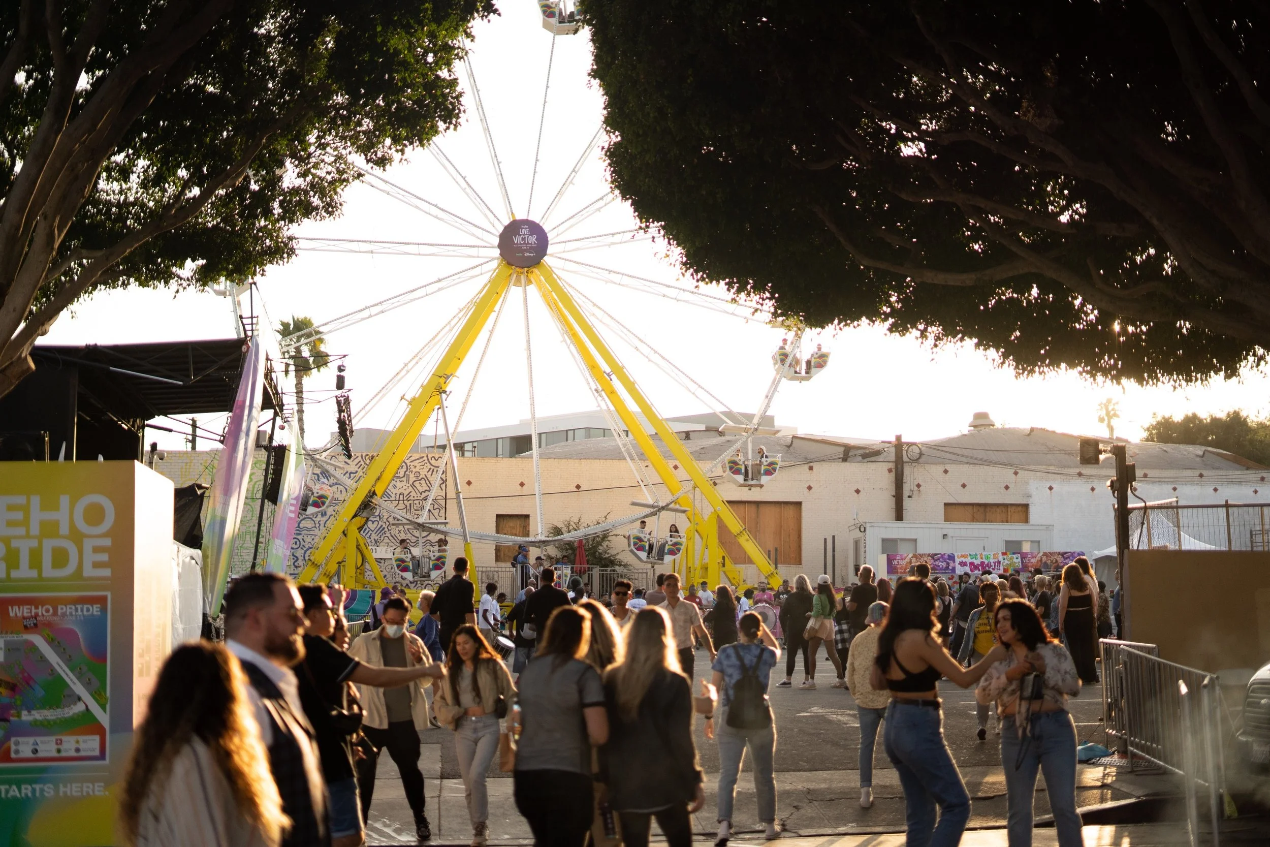
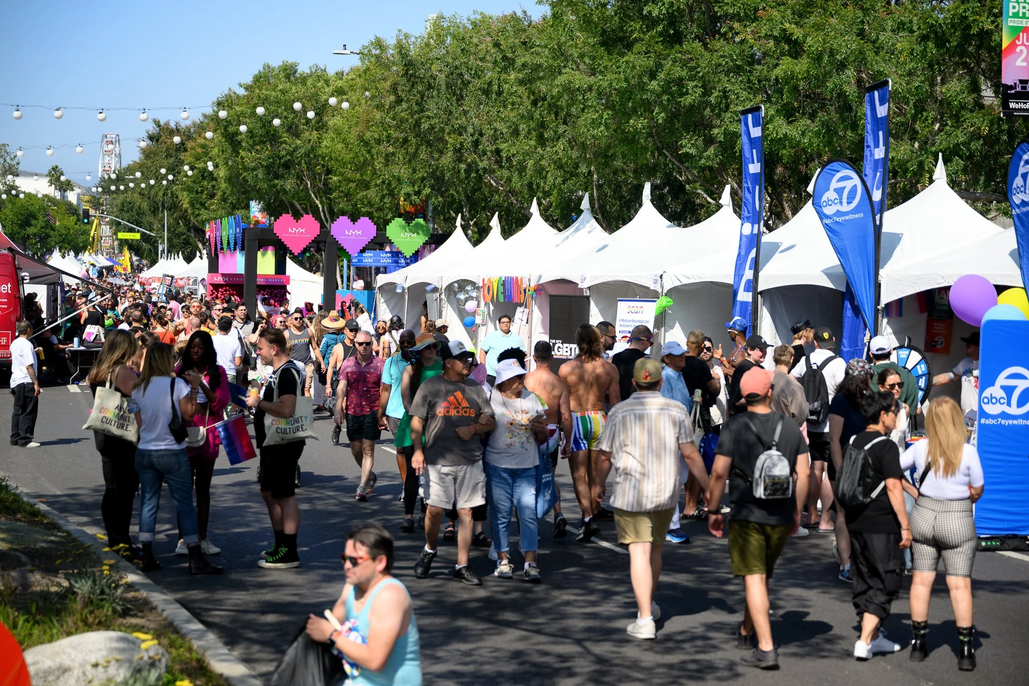
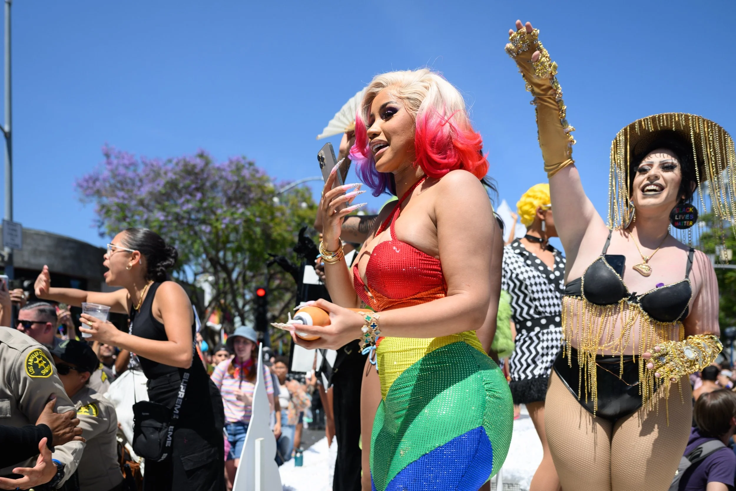
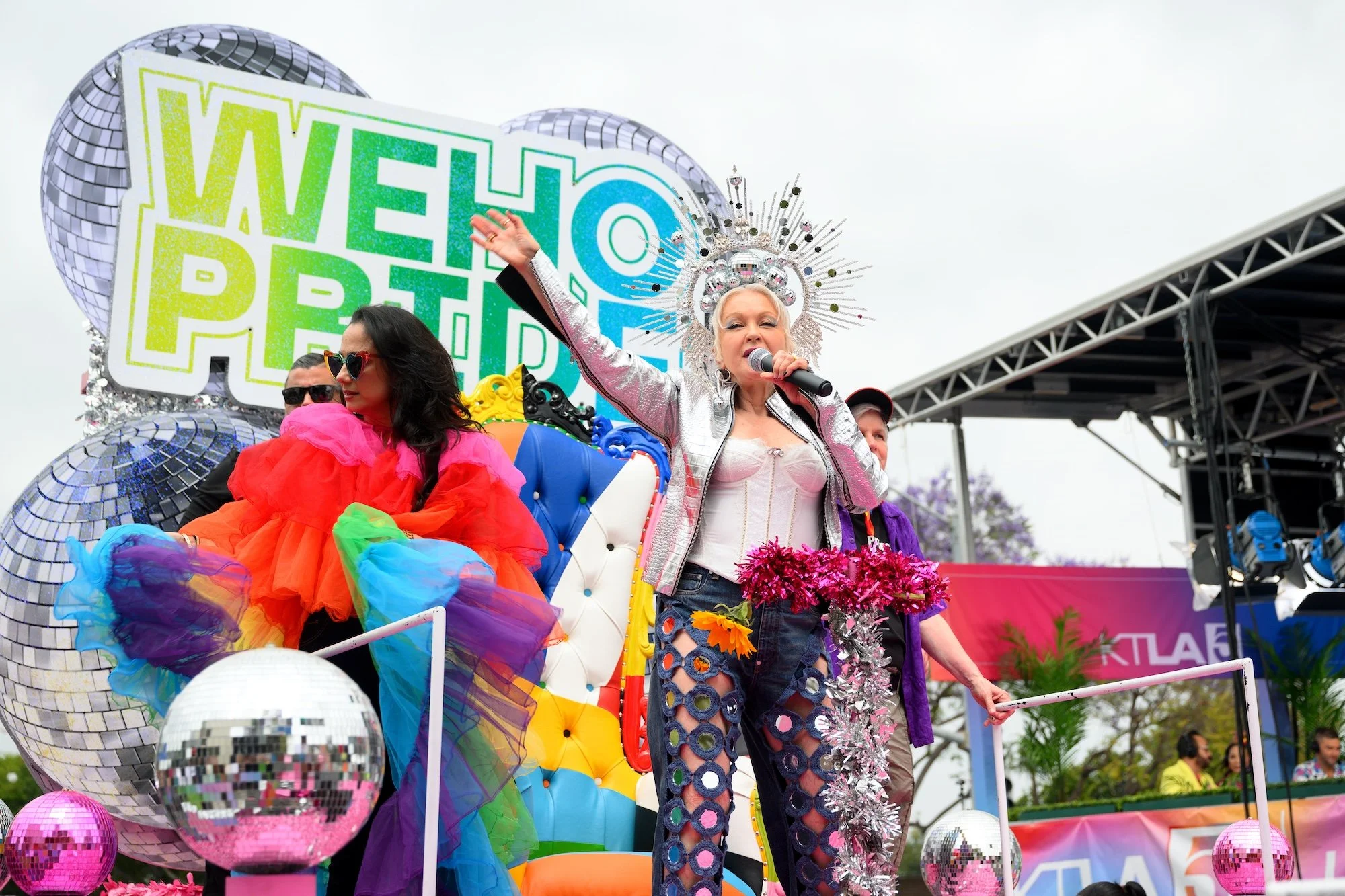
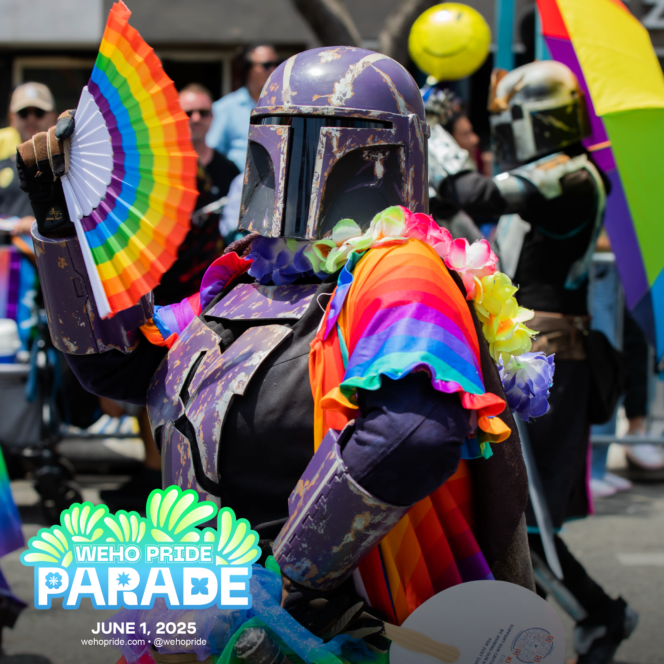
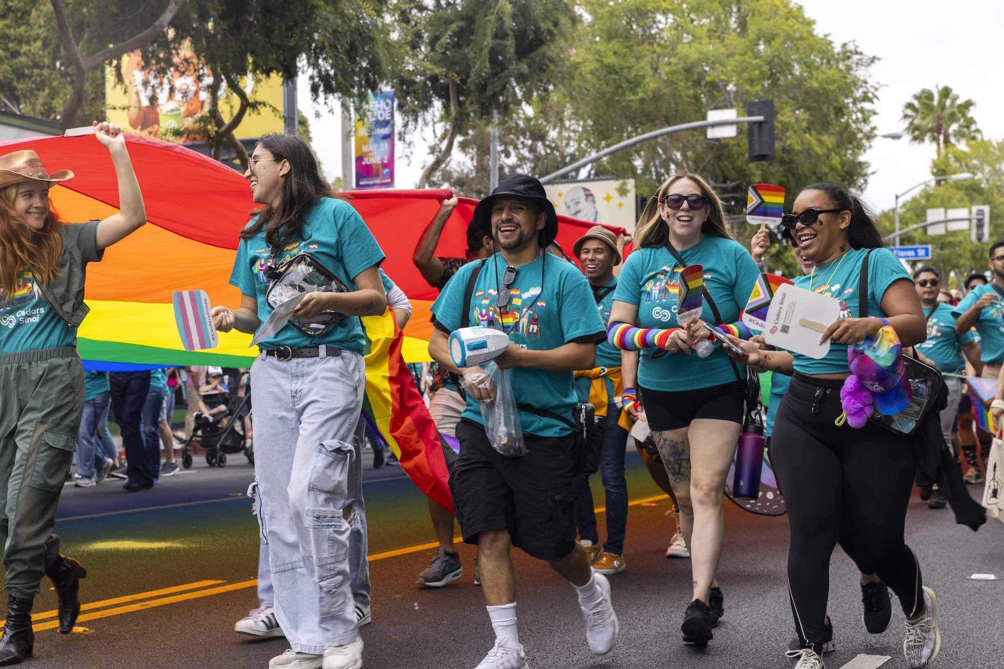
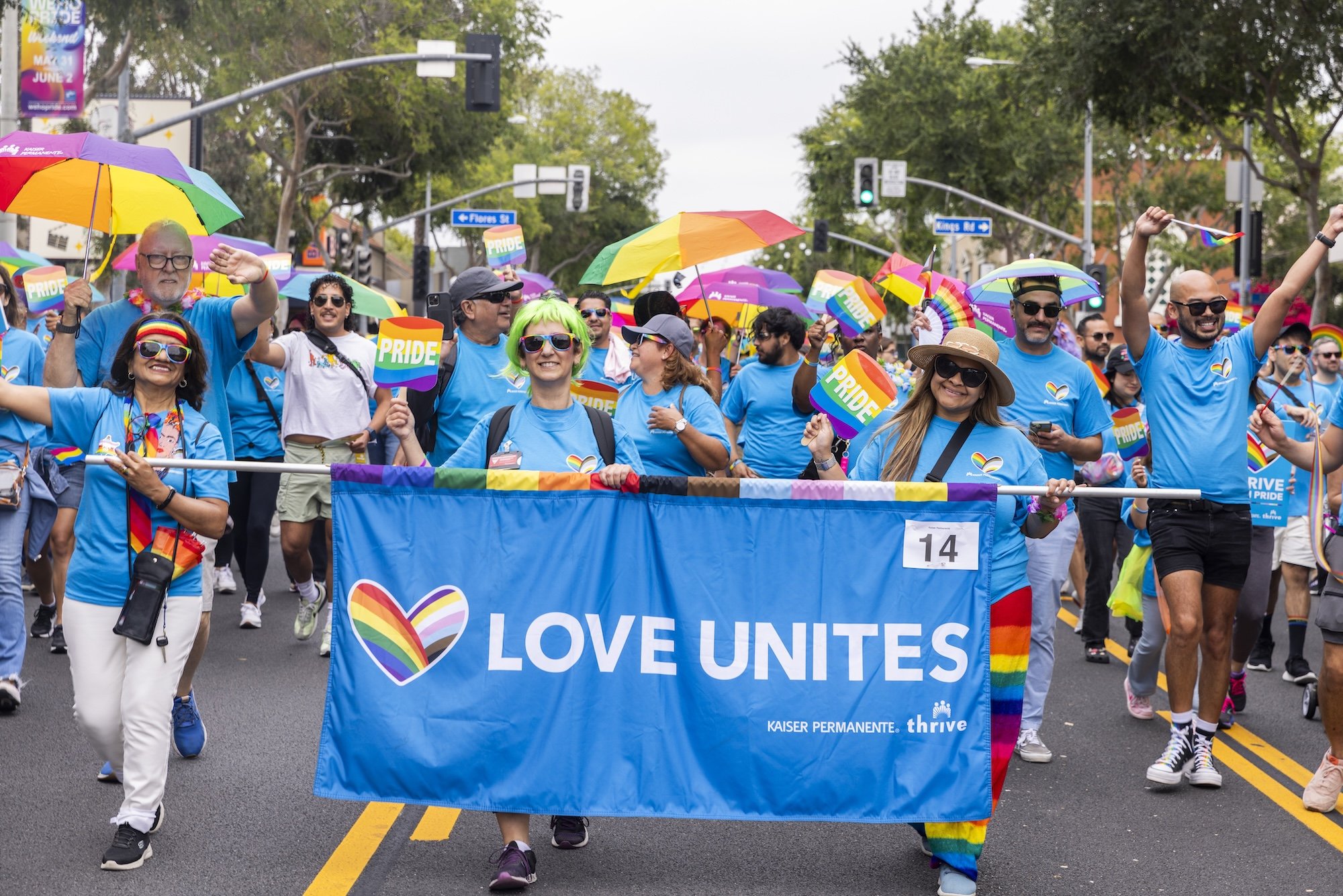
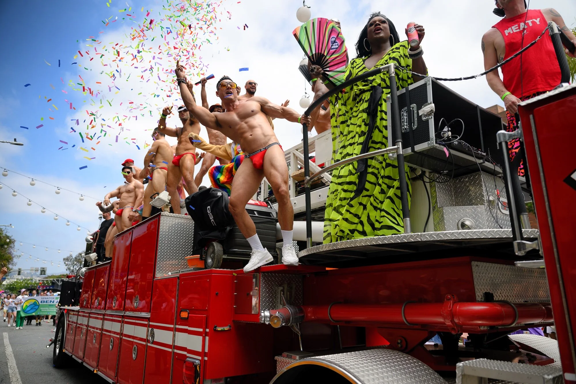
For decades, West Hollywood has been home to one of the largest annual Pride celebrations in the world, drawing hundreds of thousands of people each June.
When West Hollywood parted ways with LA Pride, the City sent out an RFP for a Pride of its own. I led creative on JJLA's winning pitch: I designed the founding brand and gave the event its name, "WeHo Pride." Since 2022, I've creative-directed the brand and all of its marketing, from digital ads and social to bus shelters, street pole banners, and out-of-home across the Sunset Strip.
ASSOCIATED PROJECTS




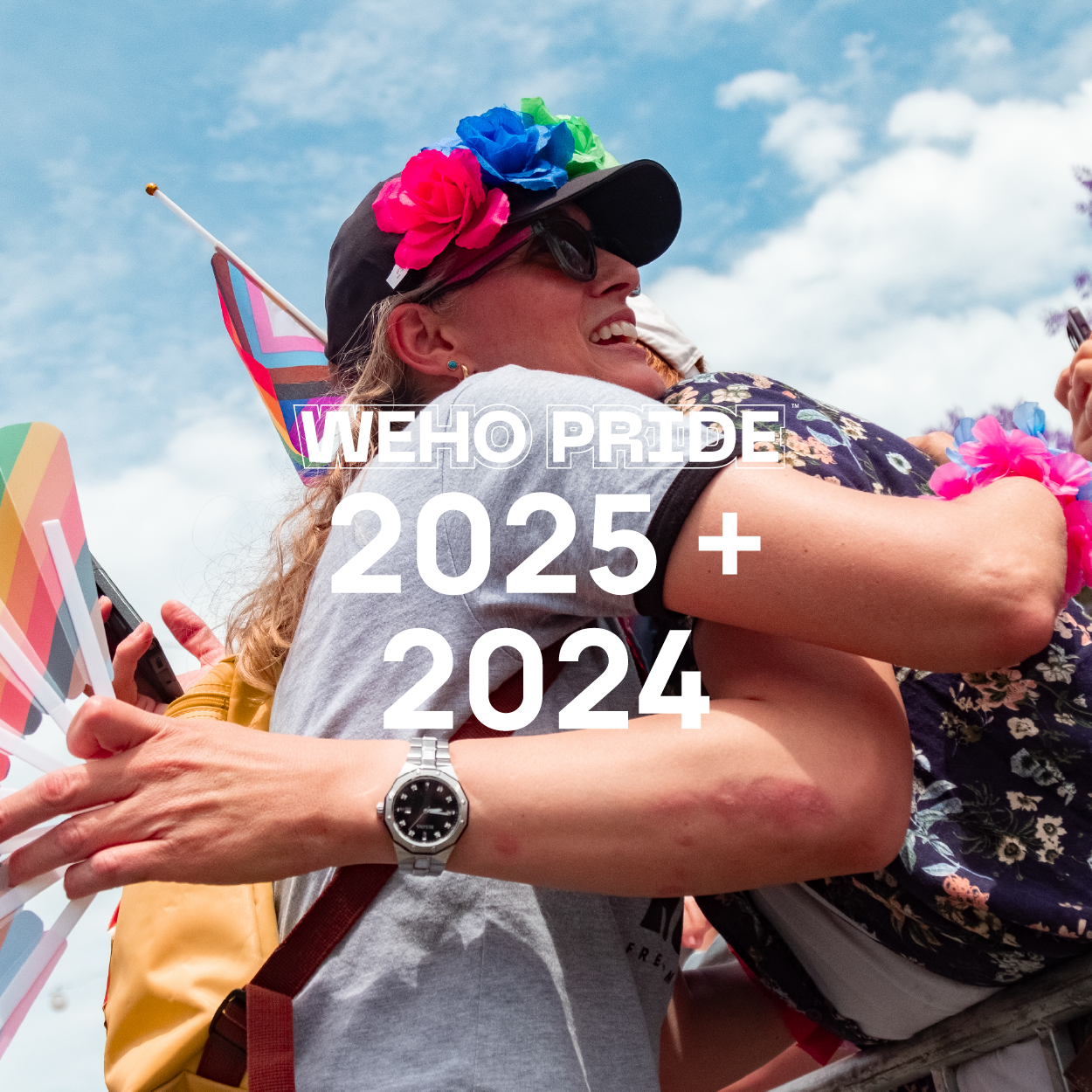


WeHo Pride
(Phase 2: 2026, 2025, 2024)
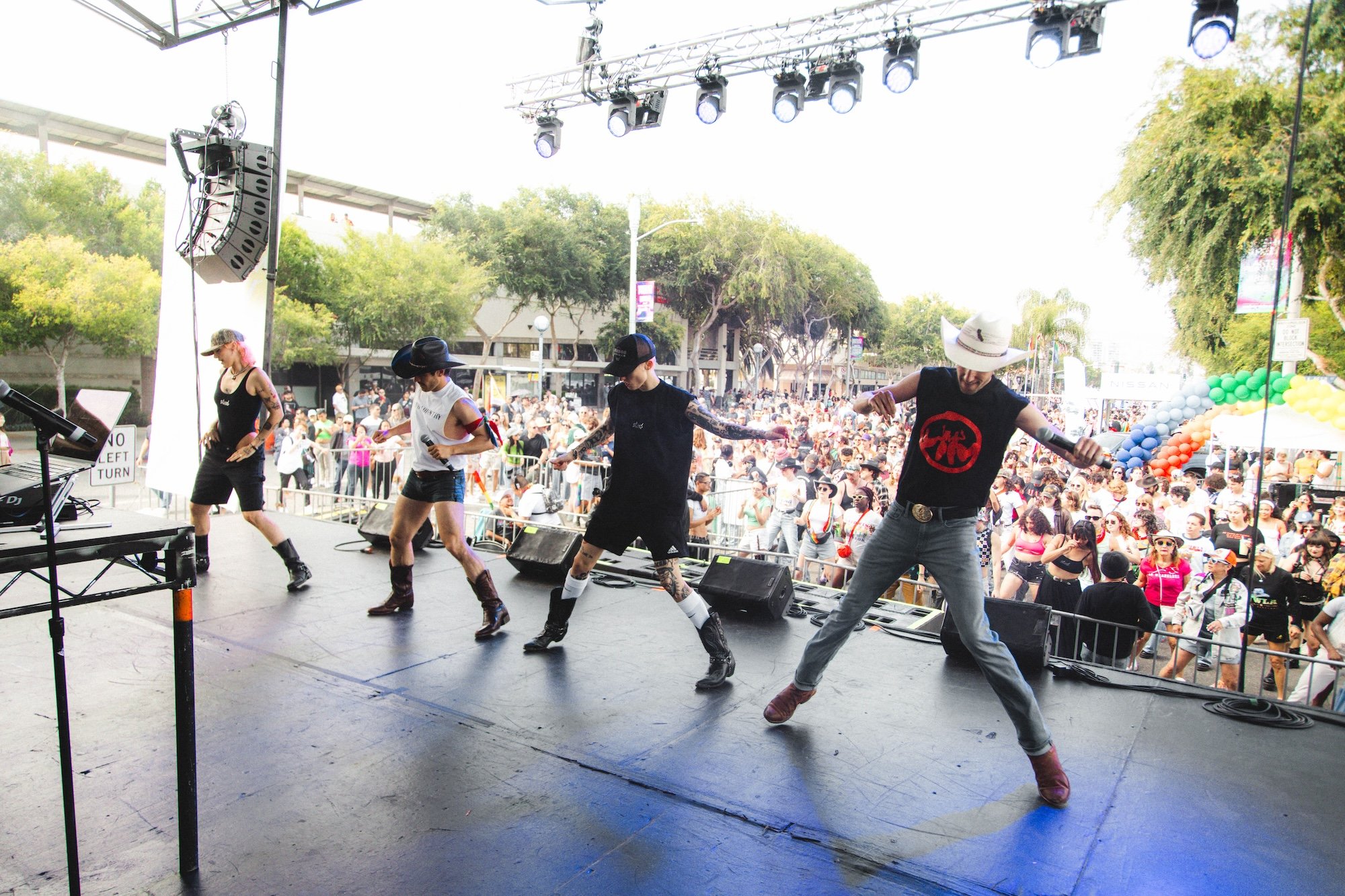
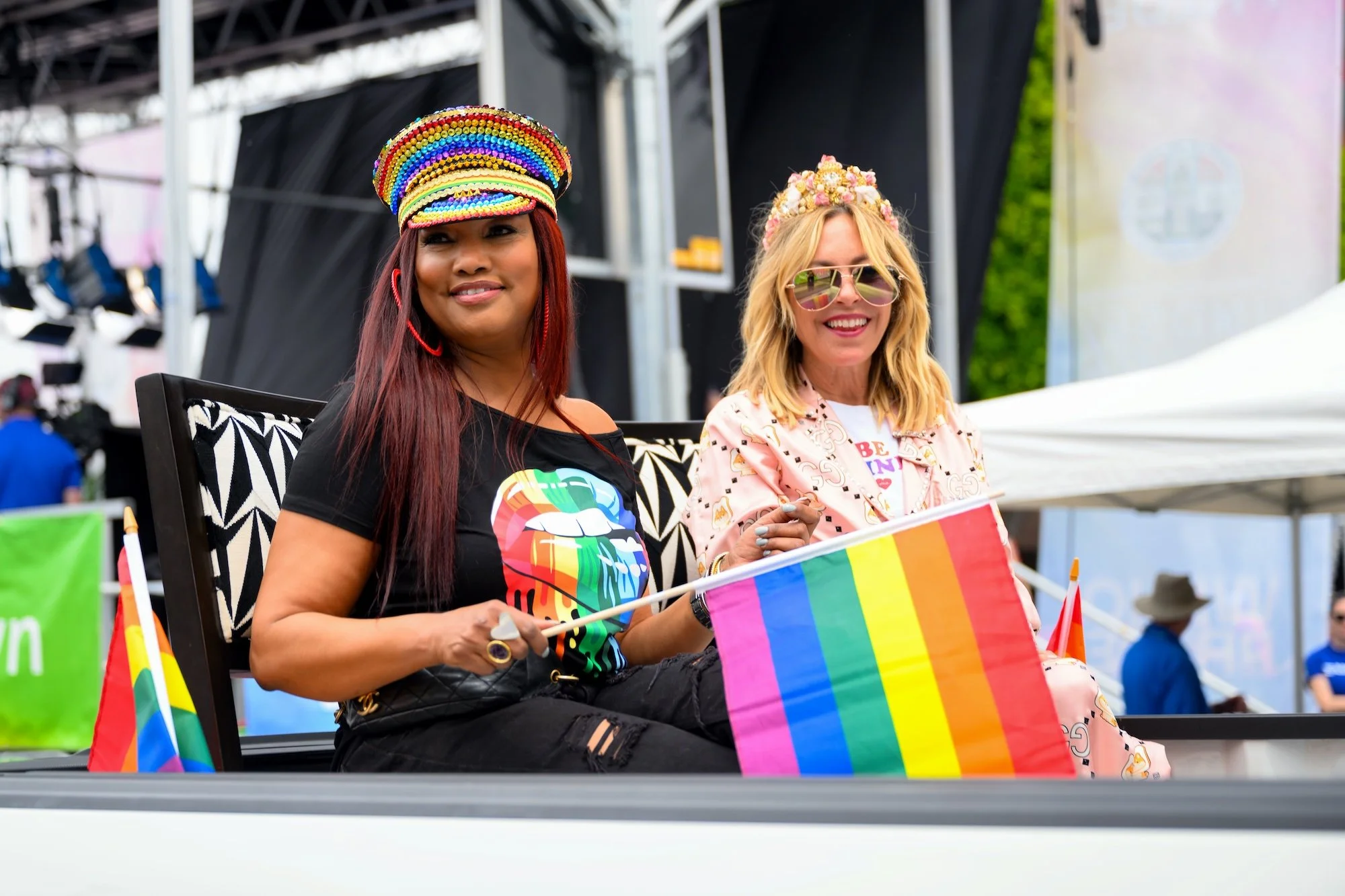
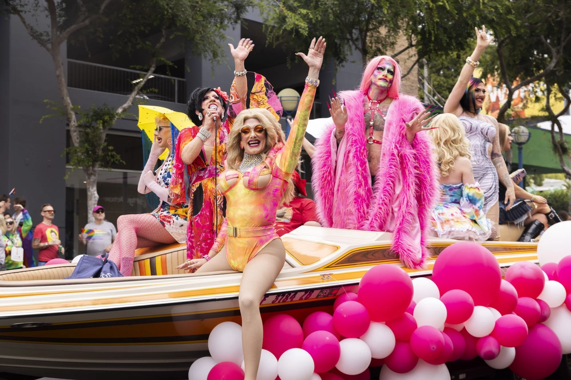
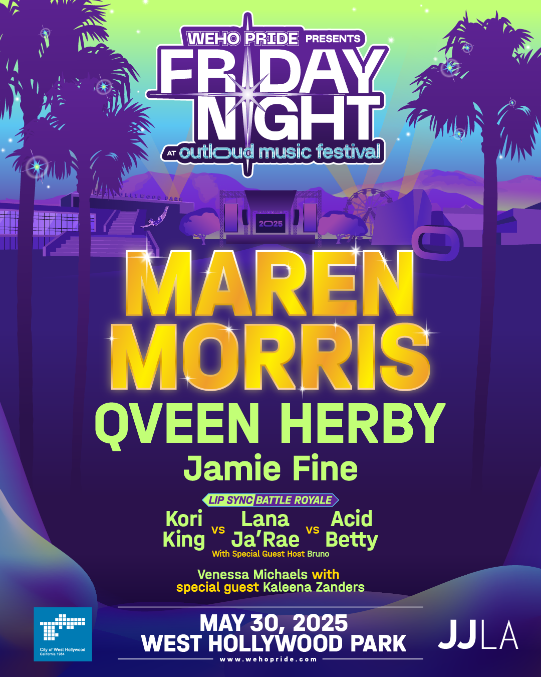
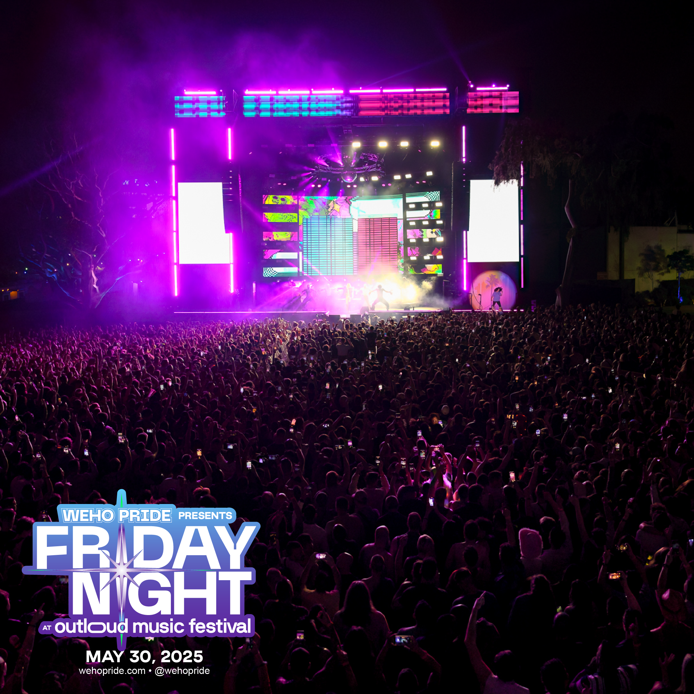
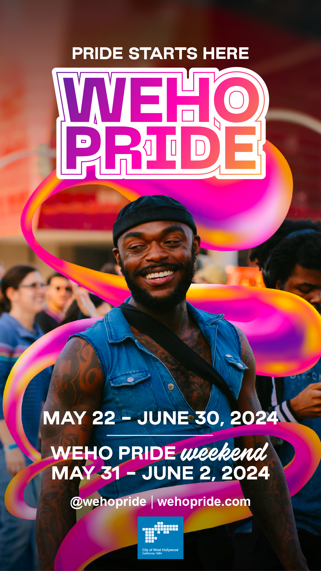
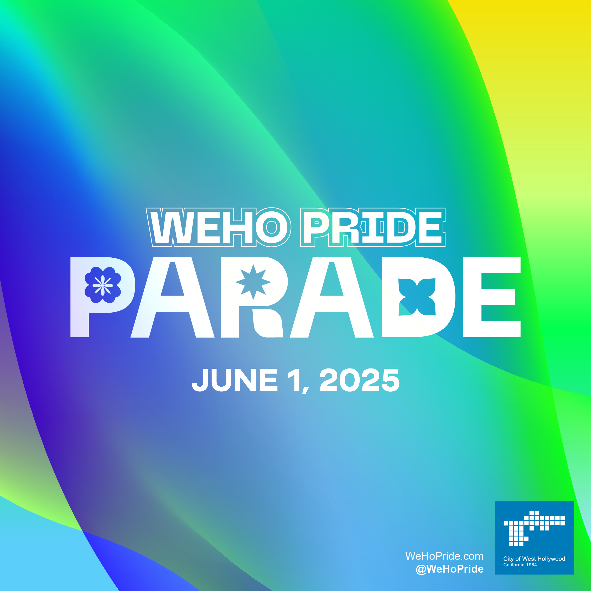
As WeHo Pride continued to grow into a world-renowned brand, we continued to polish and refine it. Bigger, brighter, and bolder than ever, we’re always pursuing new ways to serve the community the brand was built for, expanding on design concepts and iterating on successful marketing campaigns while introducing new and exciting moments for the City.


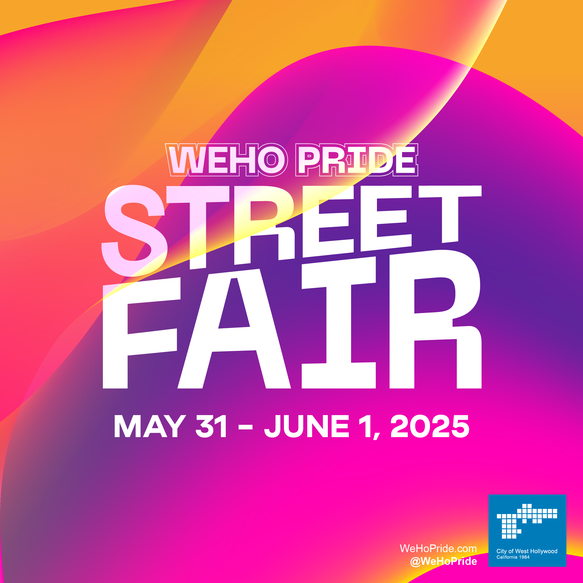
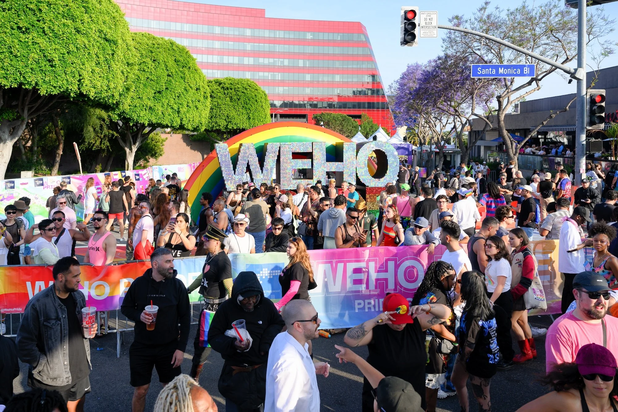

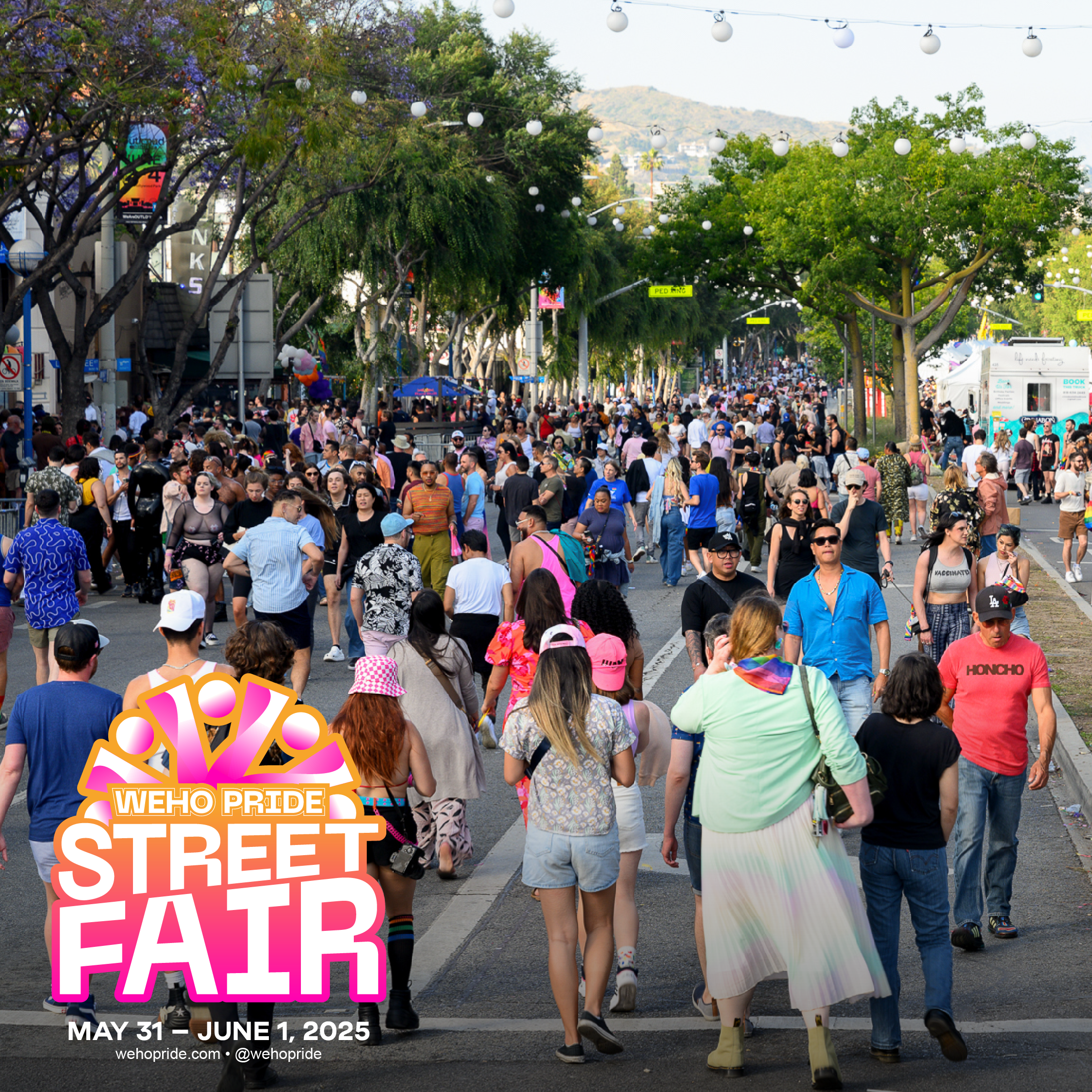

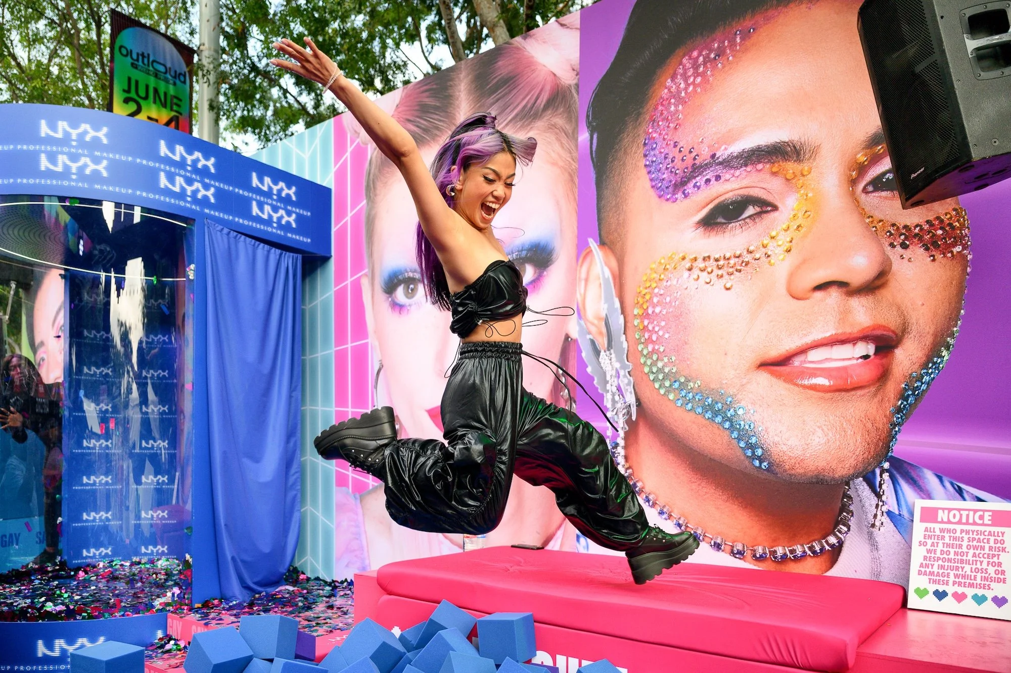
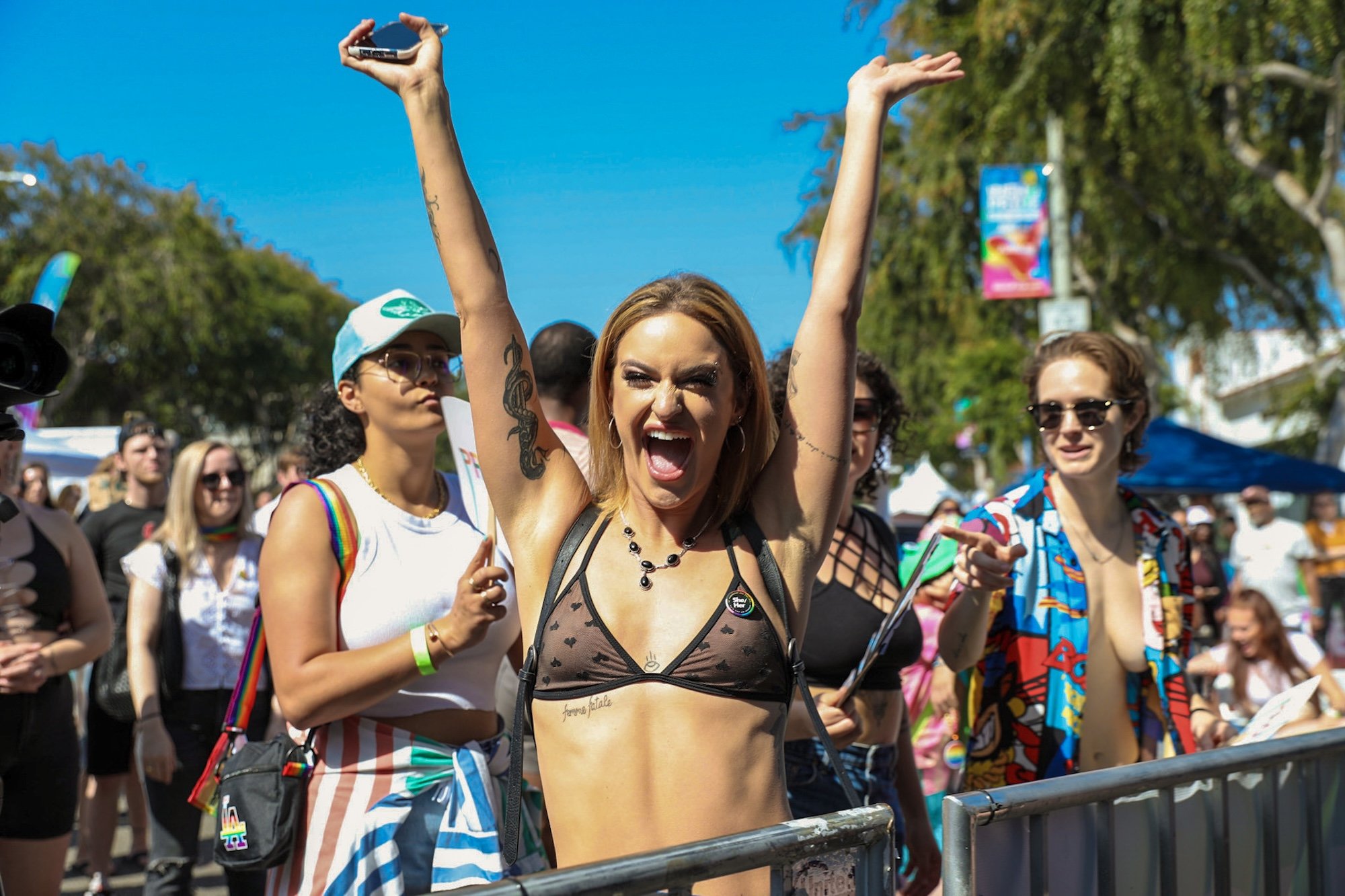



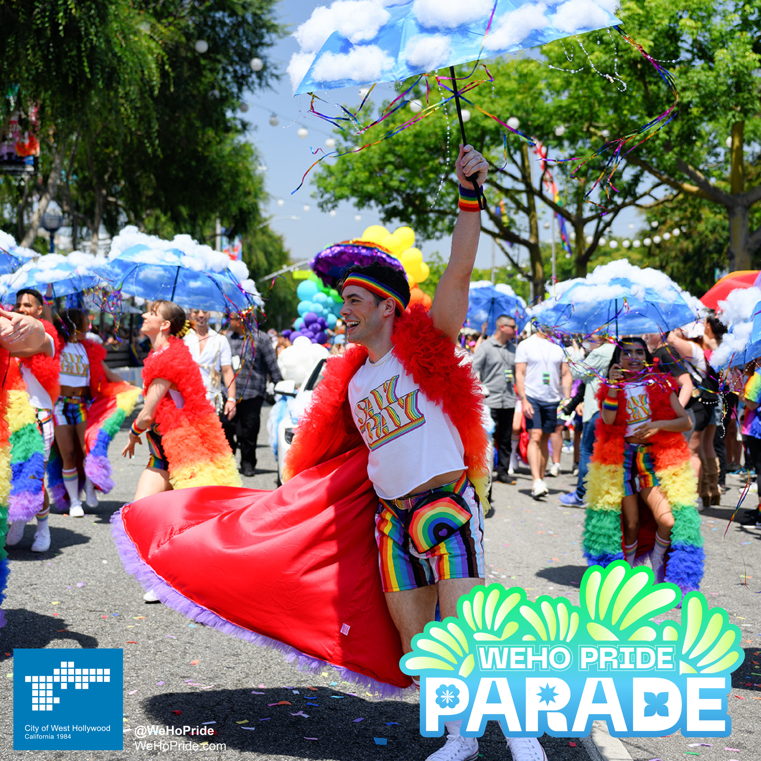
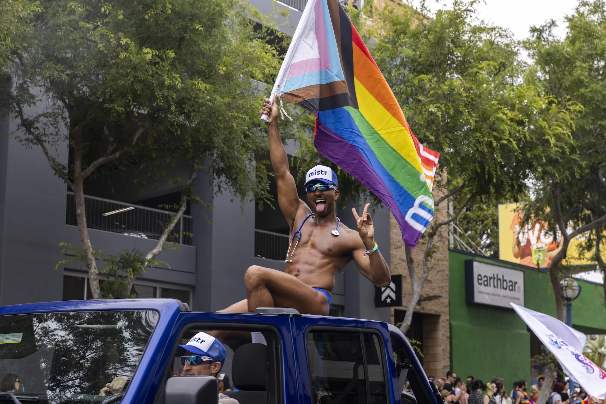
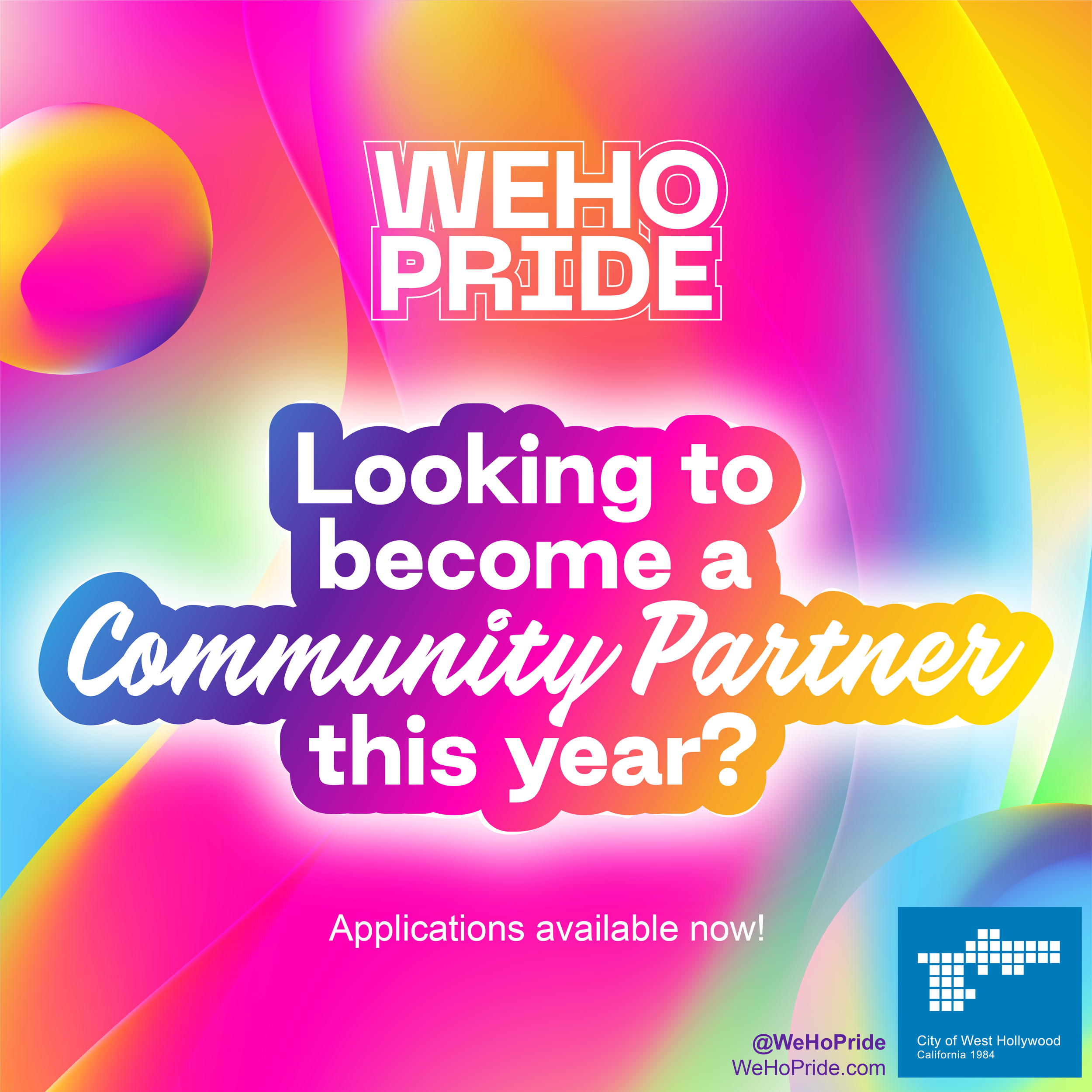
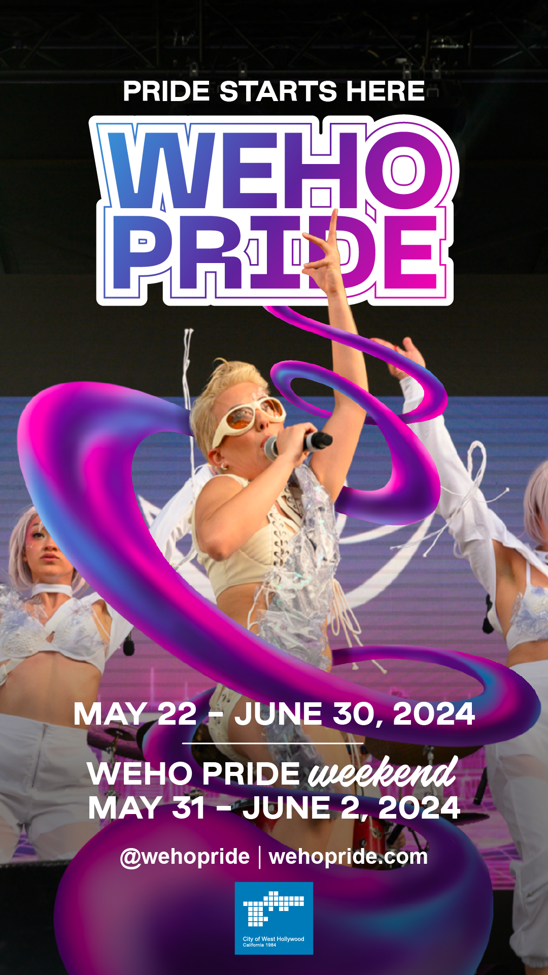
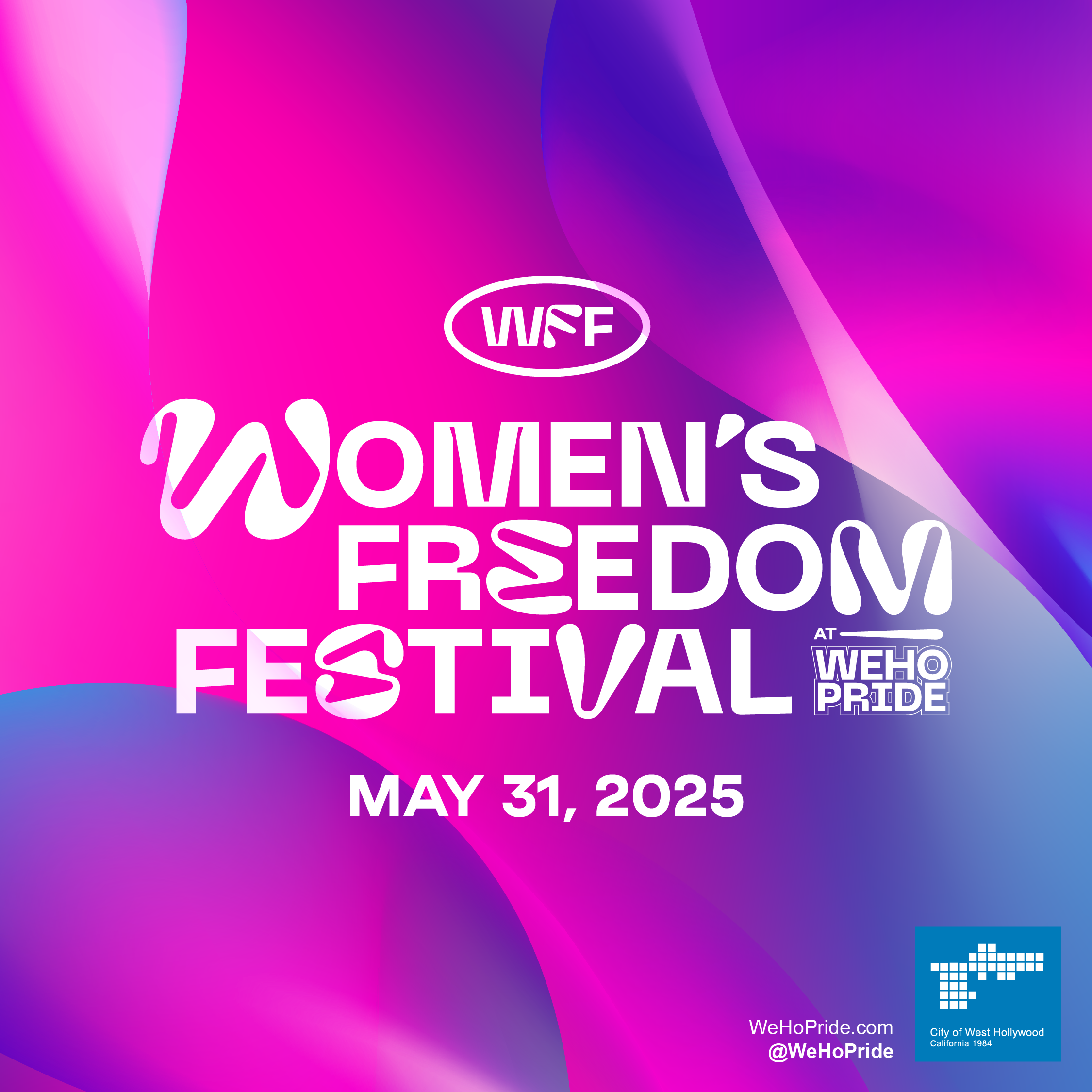


WeHo Pride Brand Update +
Universe Expansion (2024)
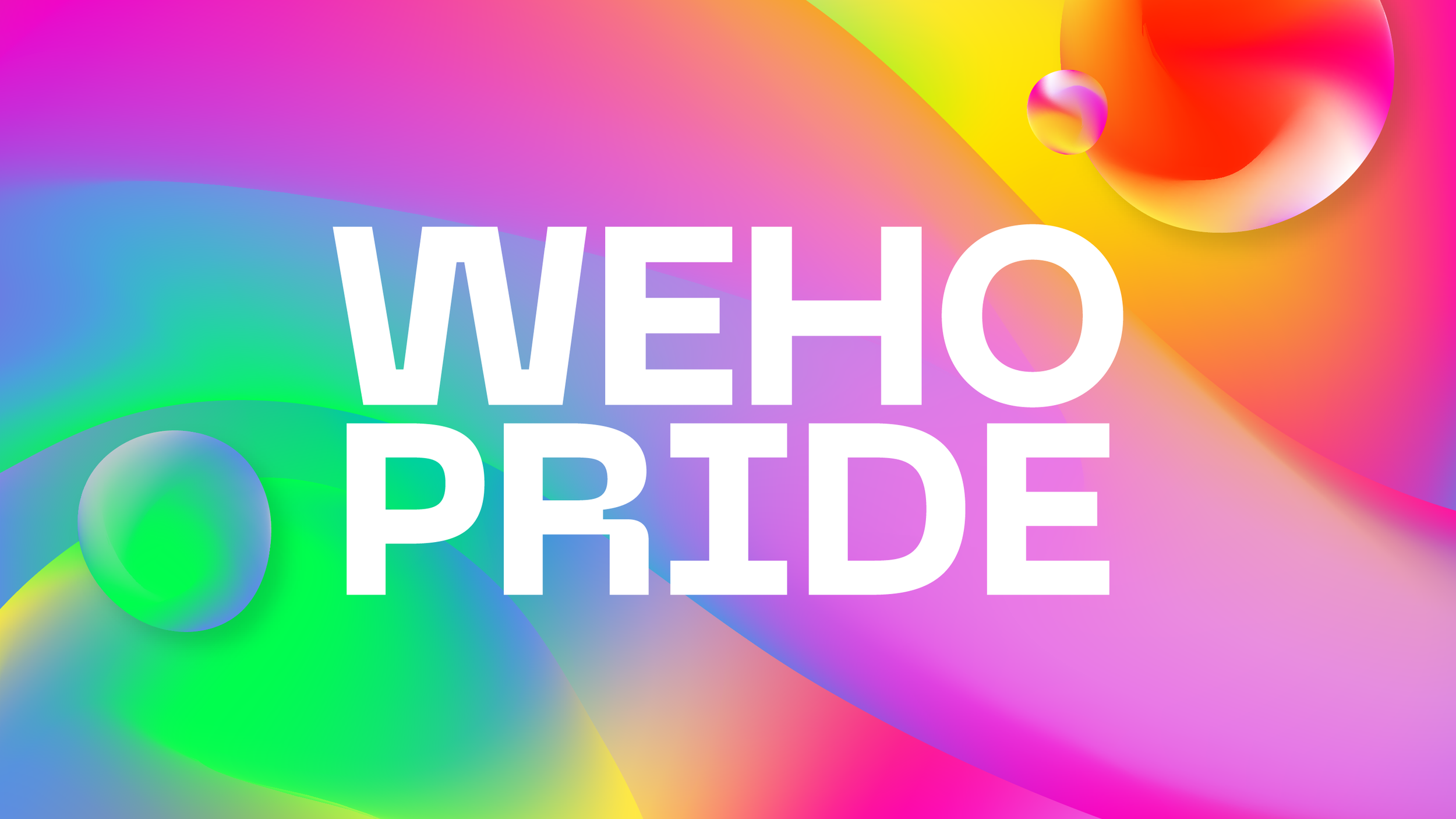
I designed the original WeHo Pride brand in under 48 hours for our pitch deck. It was meant to be a first draft; at the time, we didn't even know if the City would accept the abbreviated name "WeHo Pride," which I'd coined for the pitch. Then the City awarded us the event, and the Council was clear: the brand from the pitch deck, first draft and all, was WeHo Pride moving forward.
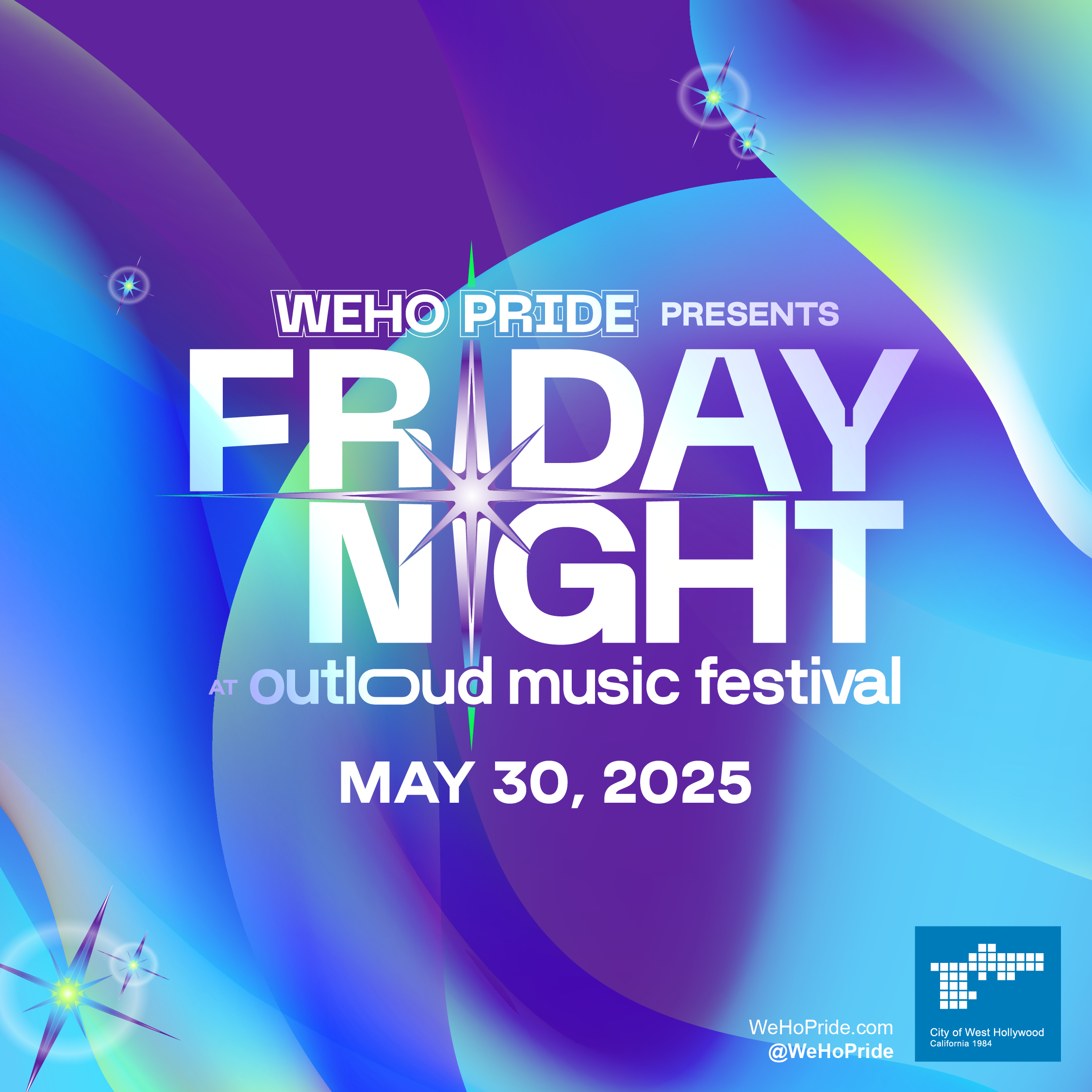
At the beginning of the 2024 planning process, we took a step back to appreciate everything that had been accomplished in two quick years and examine how the brand could utilize design theory to better communicate with the community it serves.
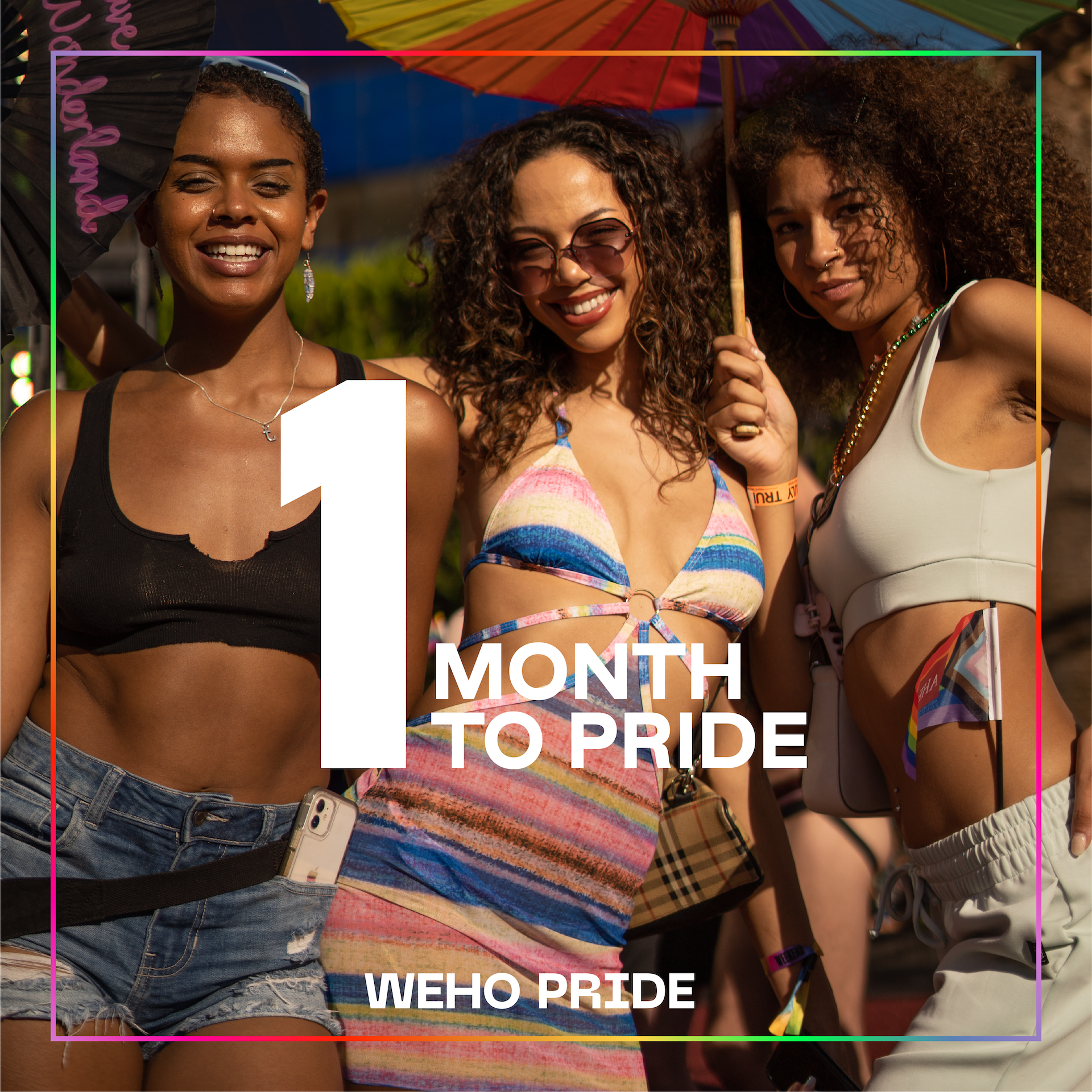
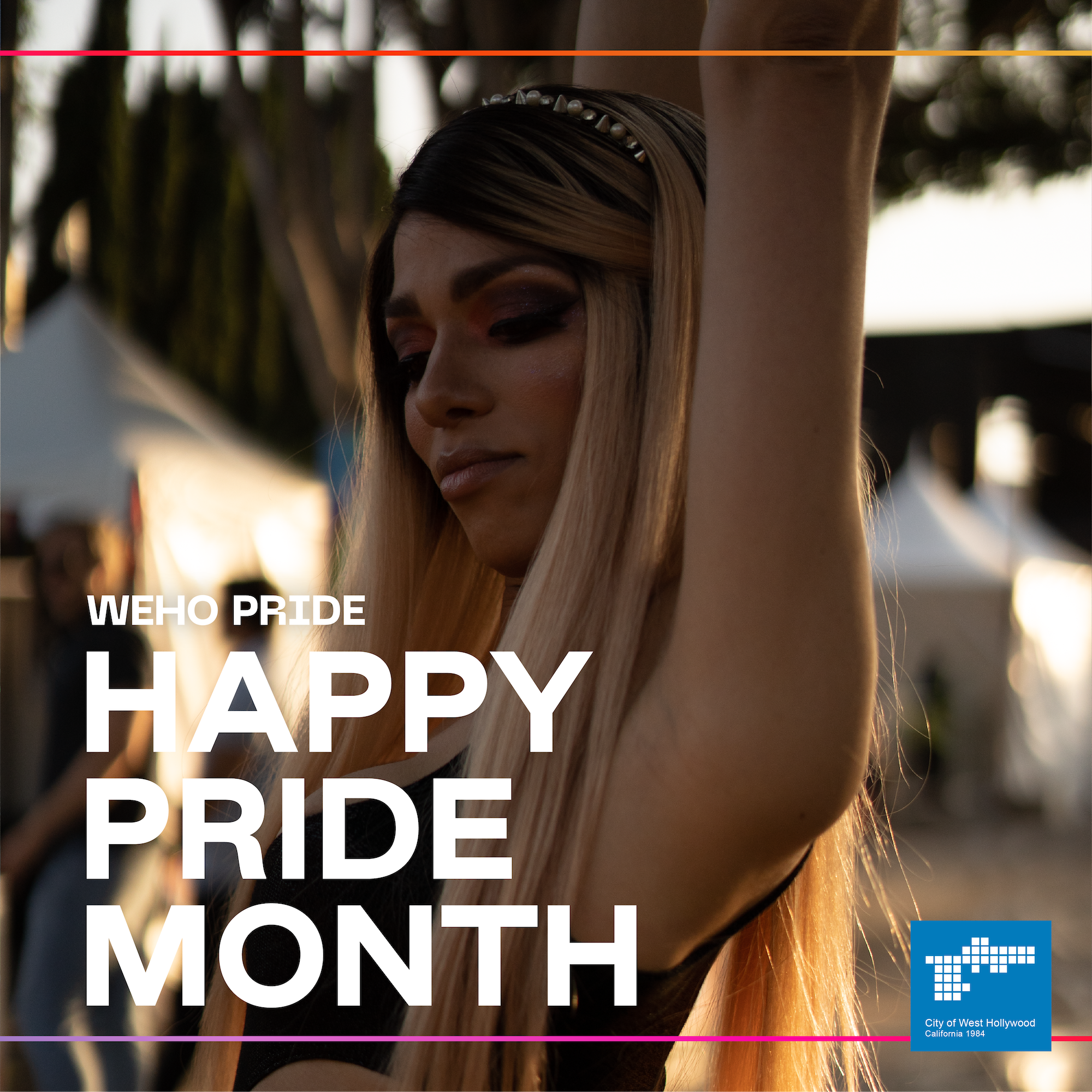
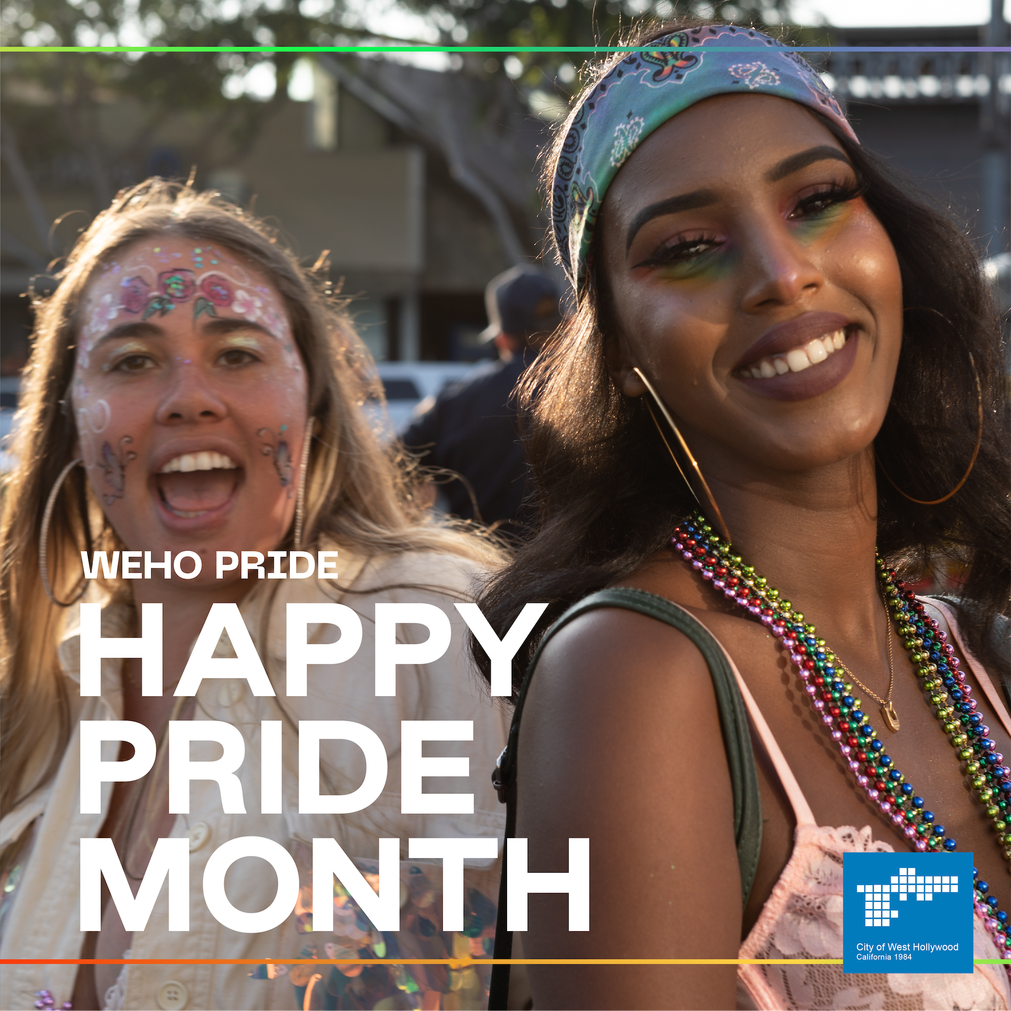
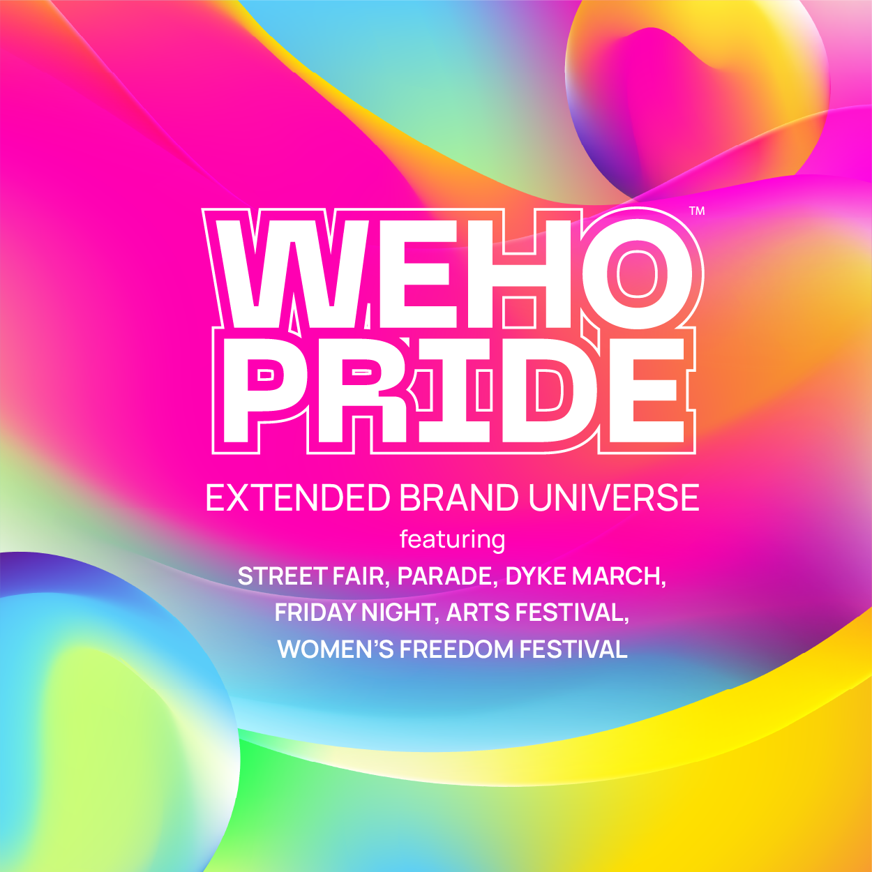
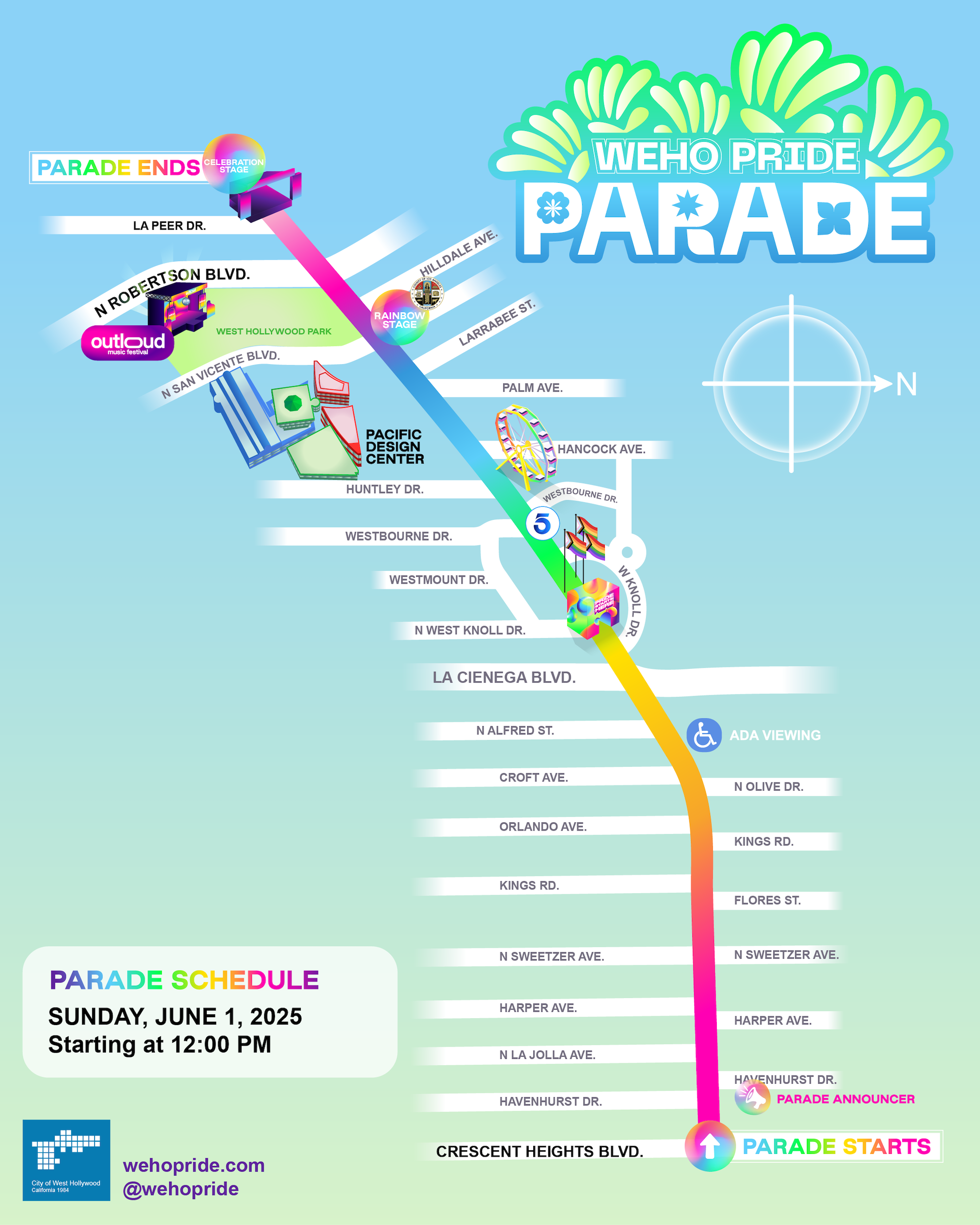
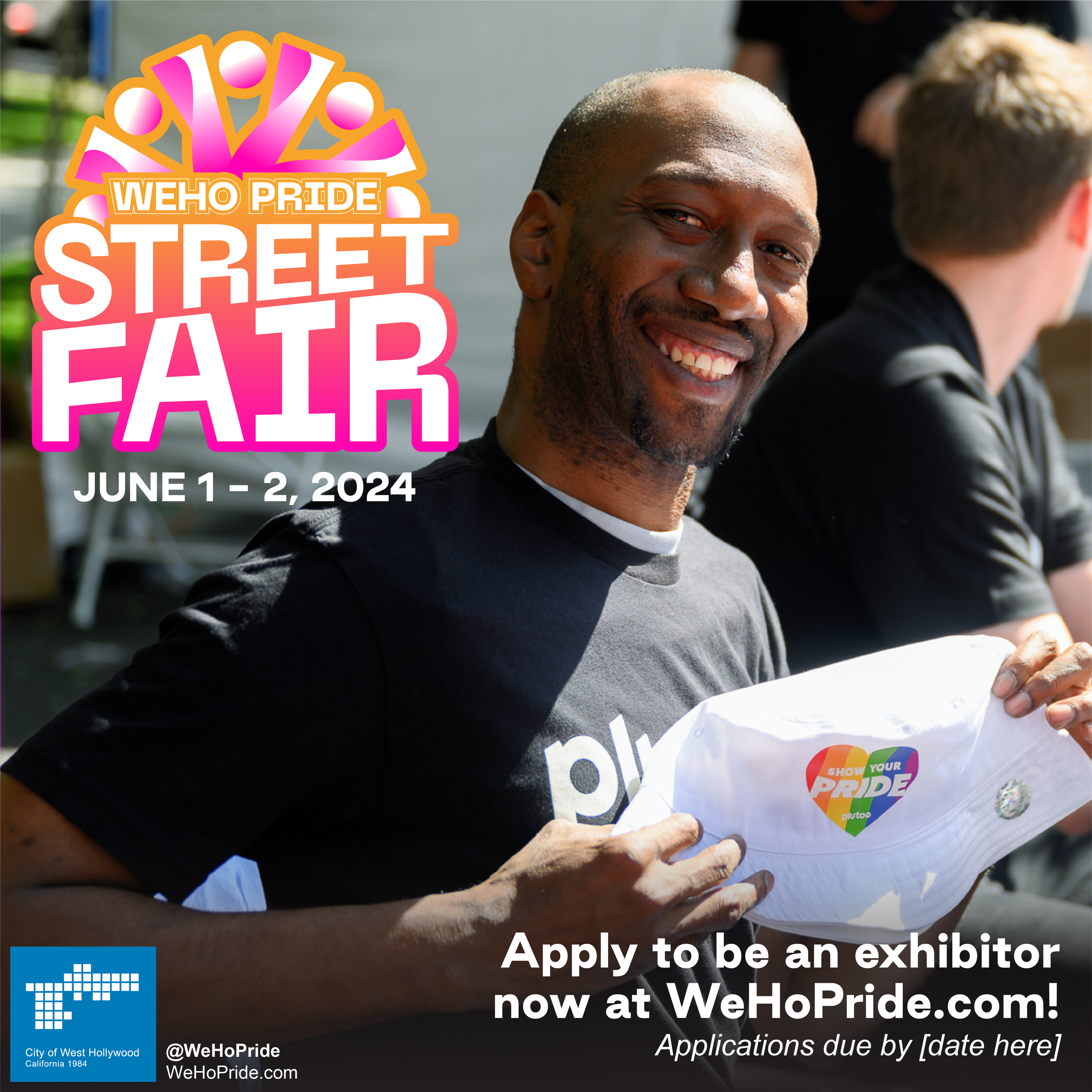
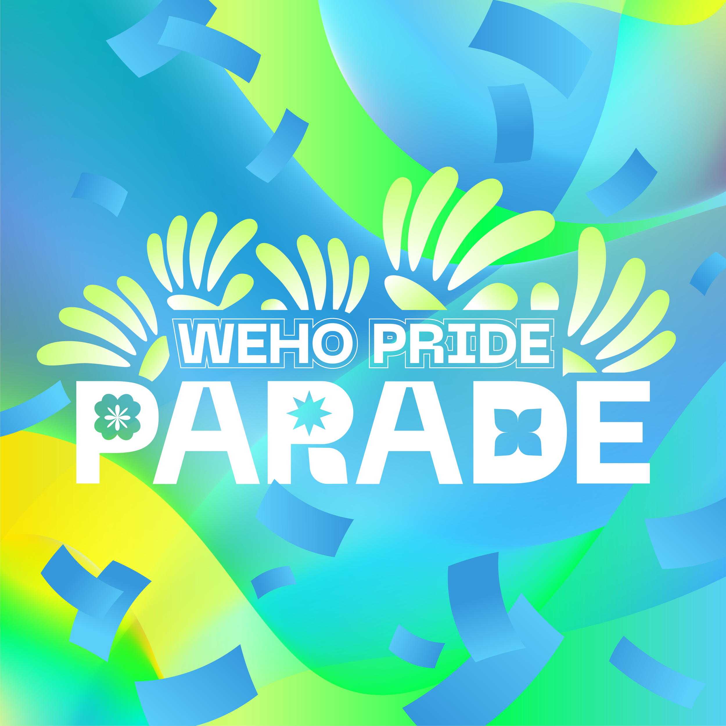
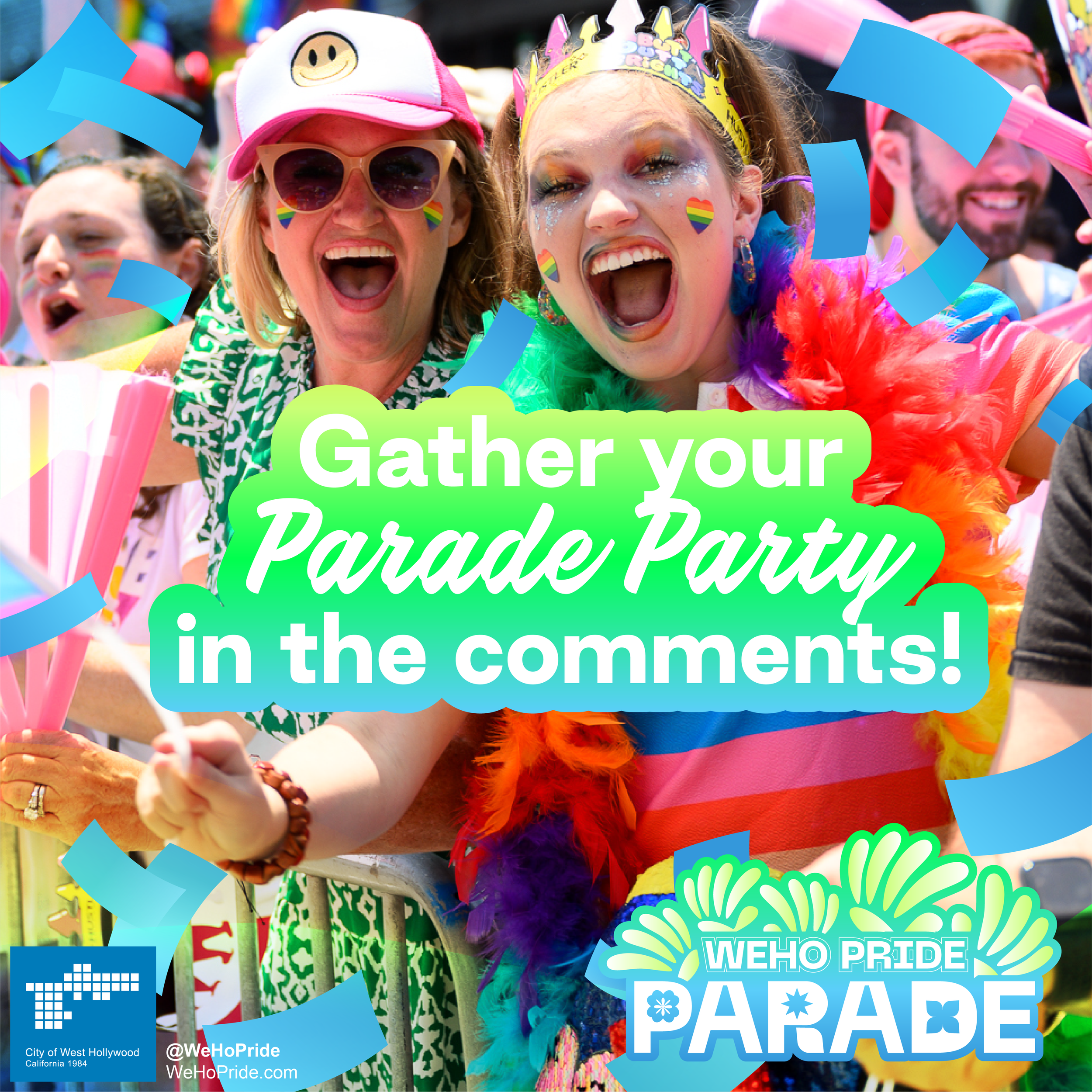
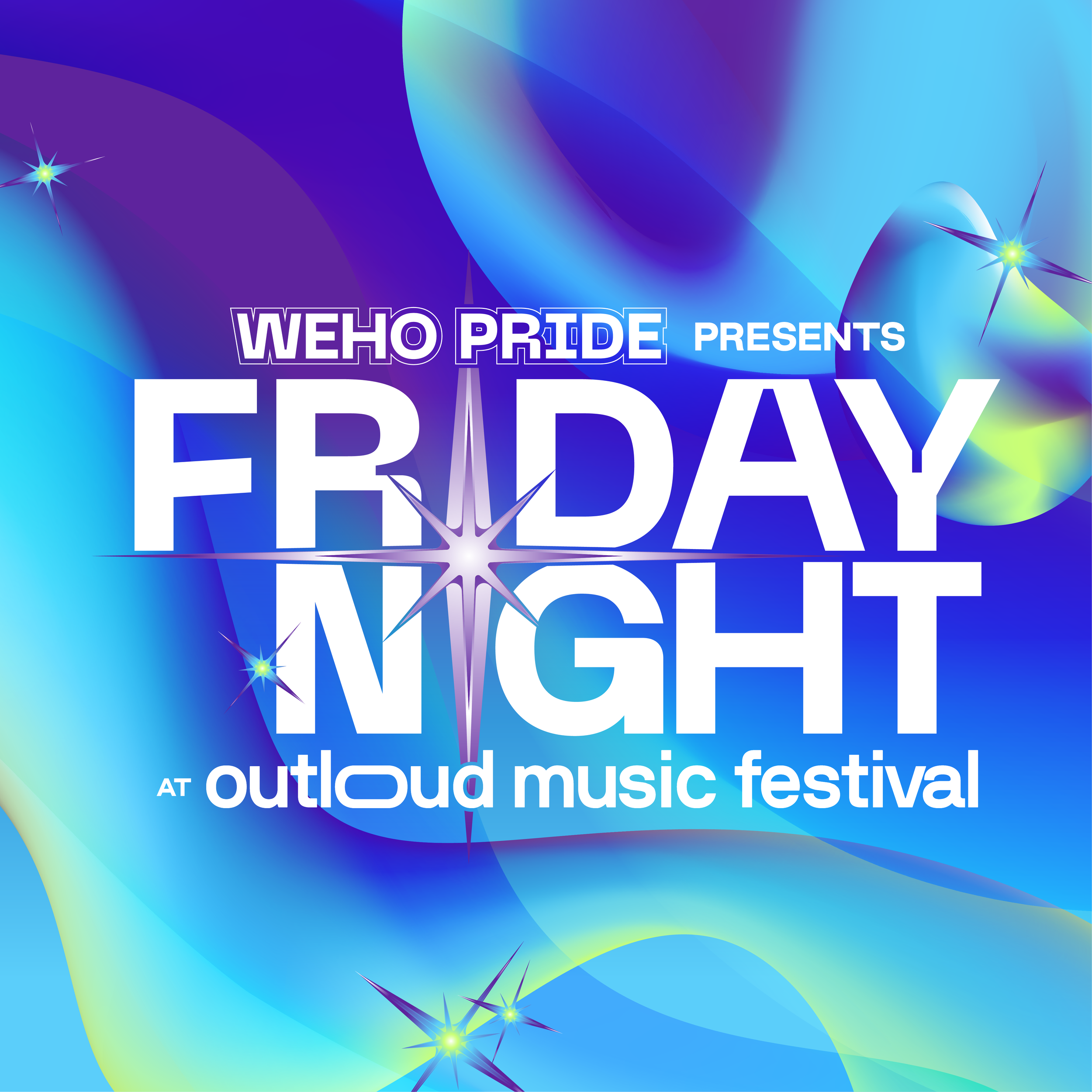
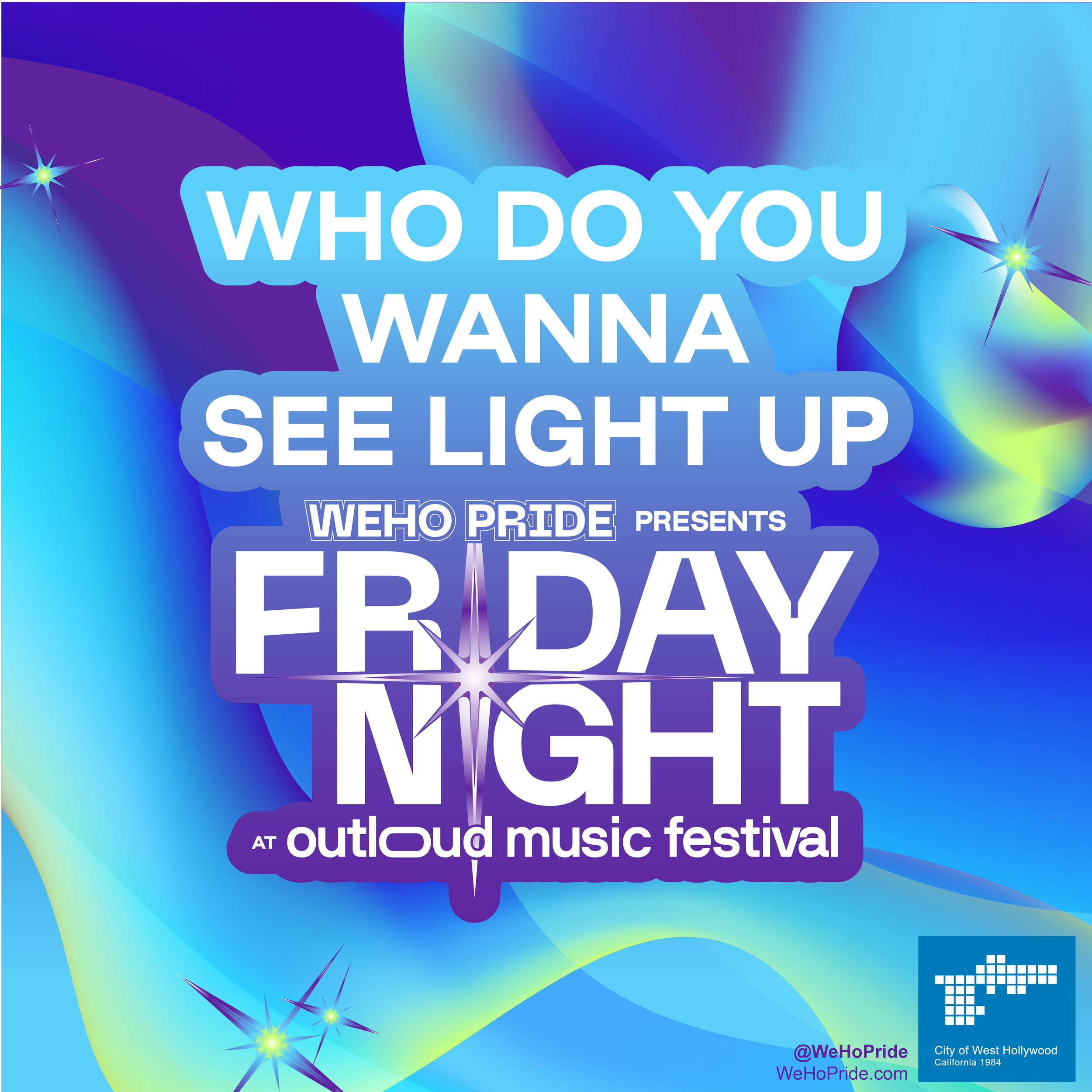
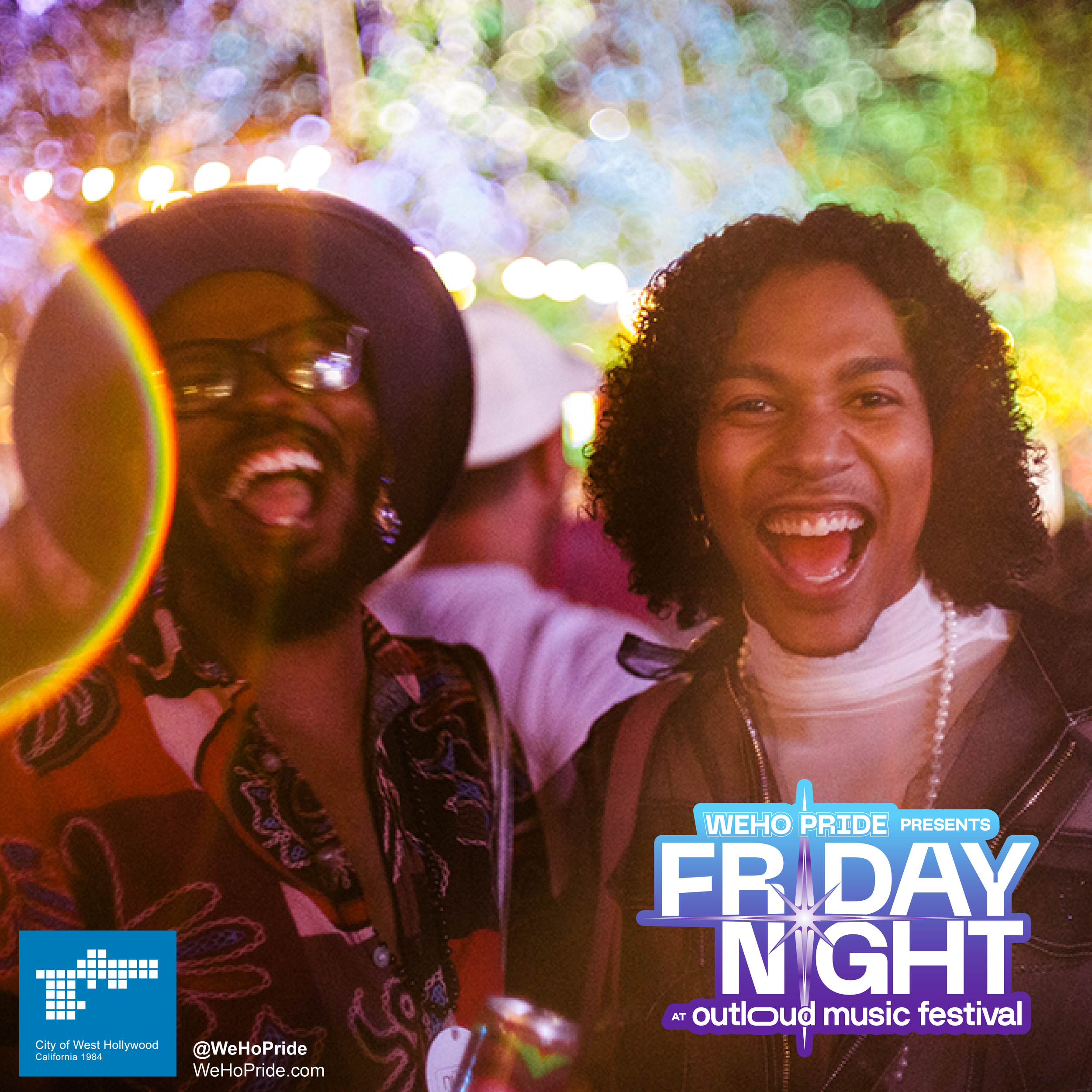
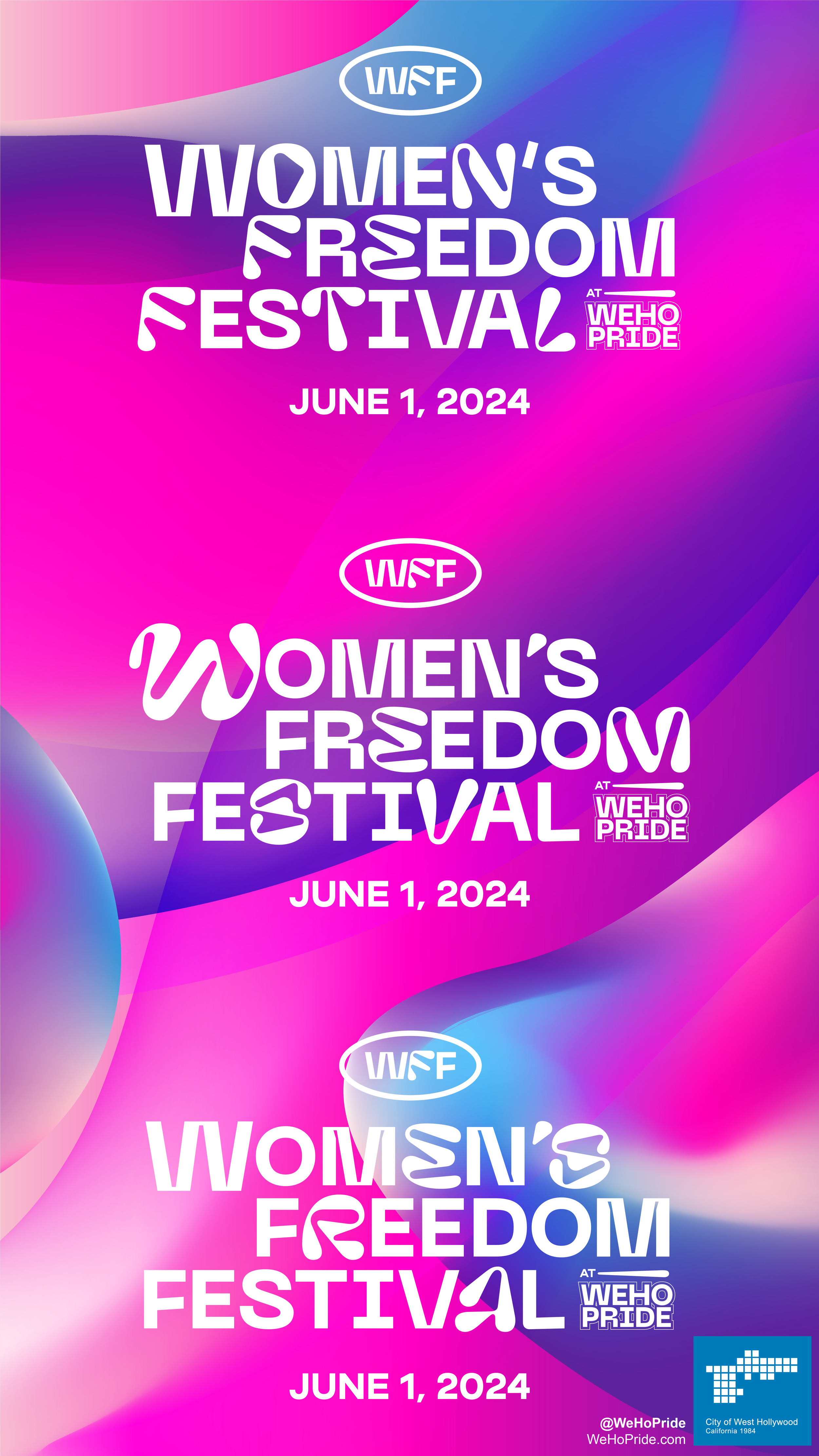
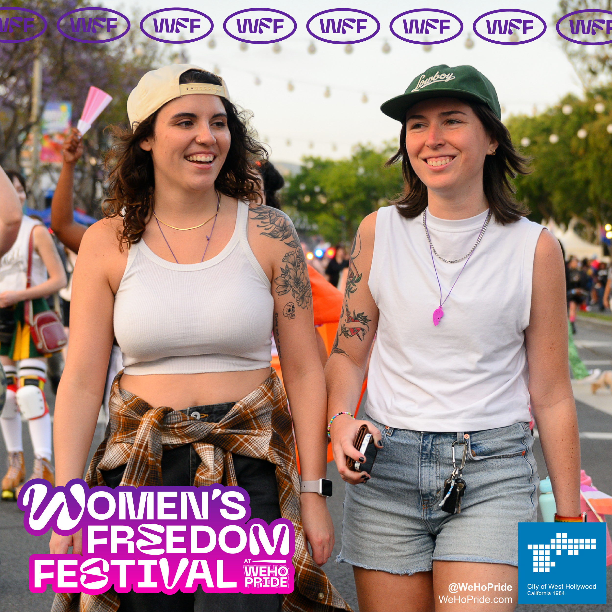
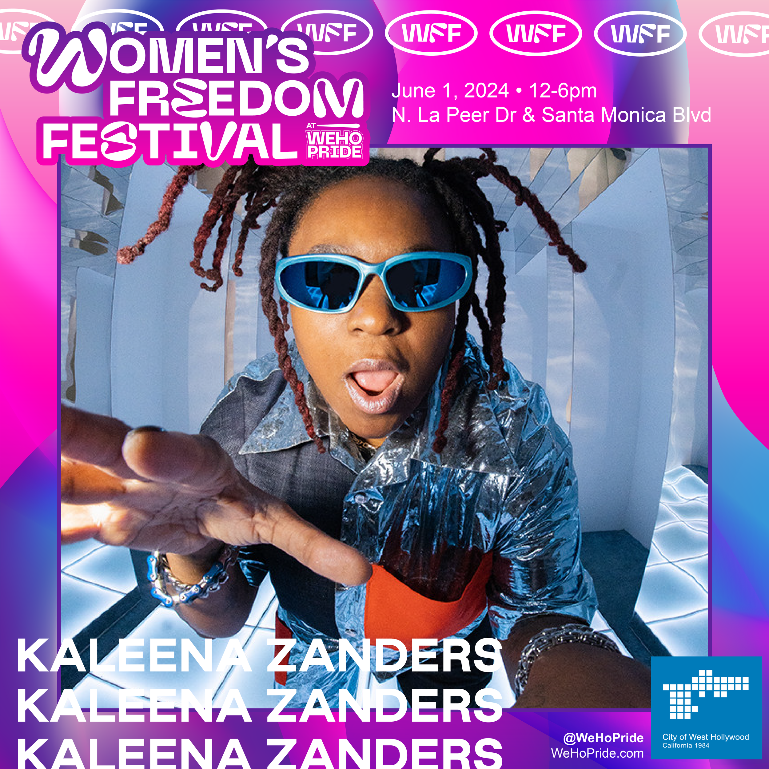
WeHo Pride wanted to be the same brand people had come to recognize, but with a little louder volume, reaching everyone with the info they need more easily. With six tent-pole activations, WeHo Pride is a massive event, and the design needed to reflect that breadth of activity; however, the singular rainbow motif muddled the scope of the event’s offerings.
By dissecting the design elements of the overall brand, WeHo Pride could create a larger rainbow that both raises awareness in ads that benefit from contrast and also can quickly communicate information for the distinctly different tentpole events.
With this design expansion, WeHo Pride moves beyond a rainbow color scheme and a font; it establishes itself as a brand with a personality and style
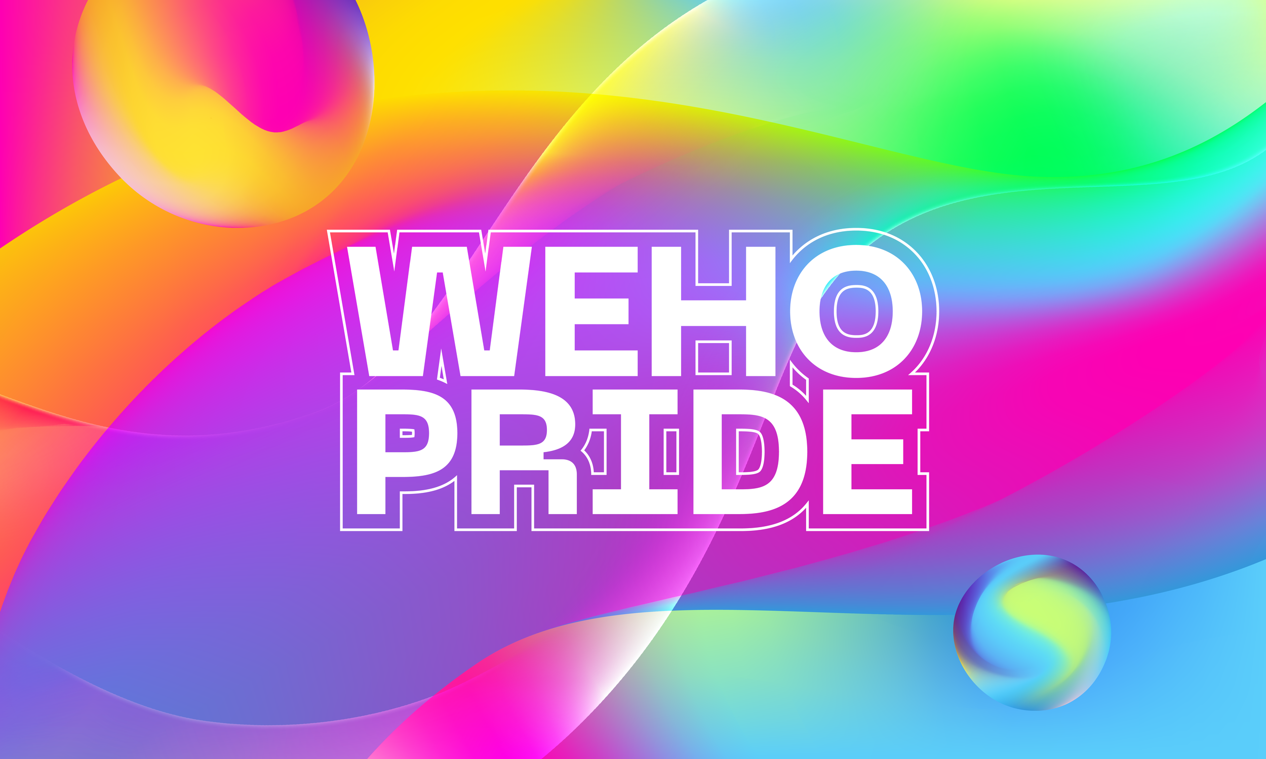

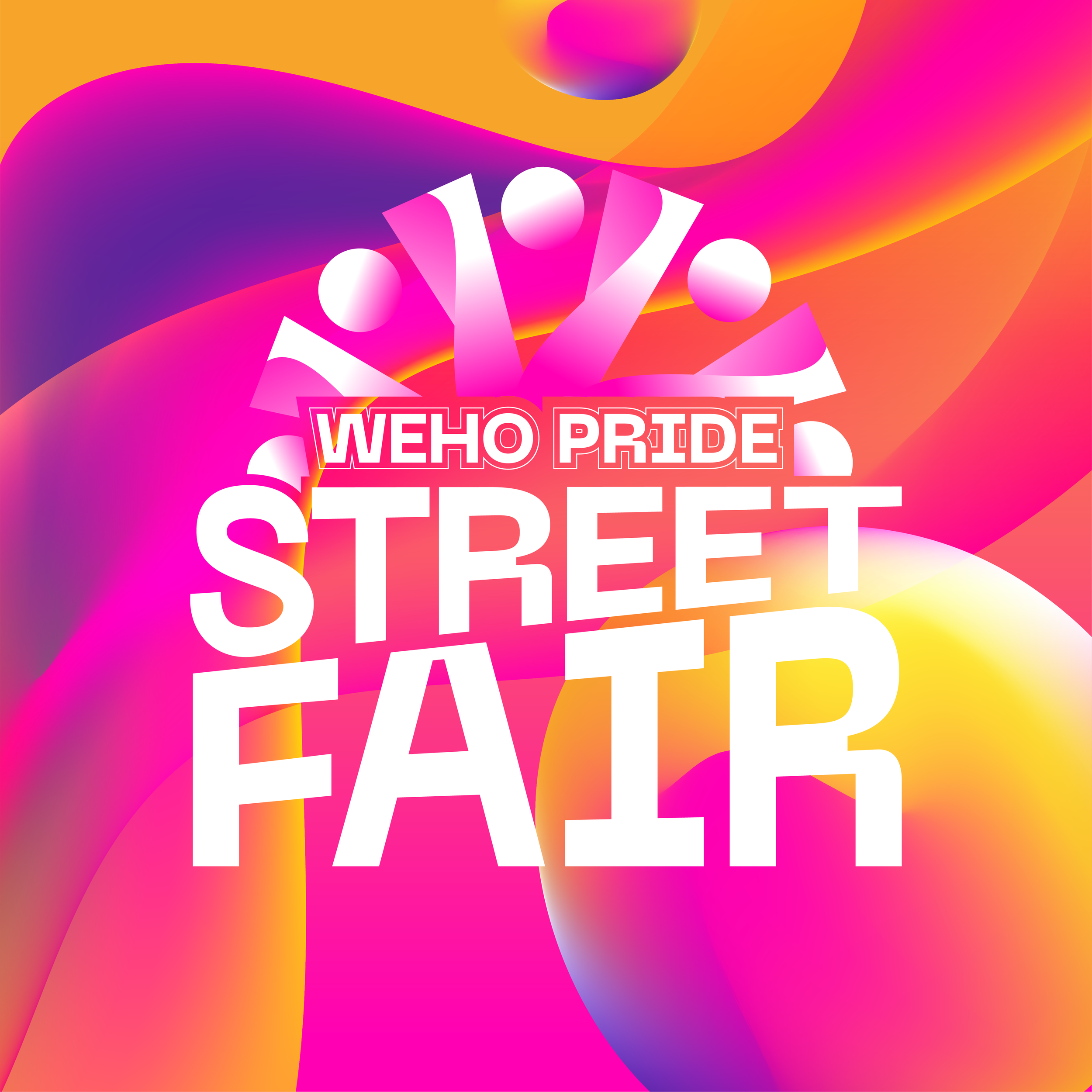
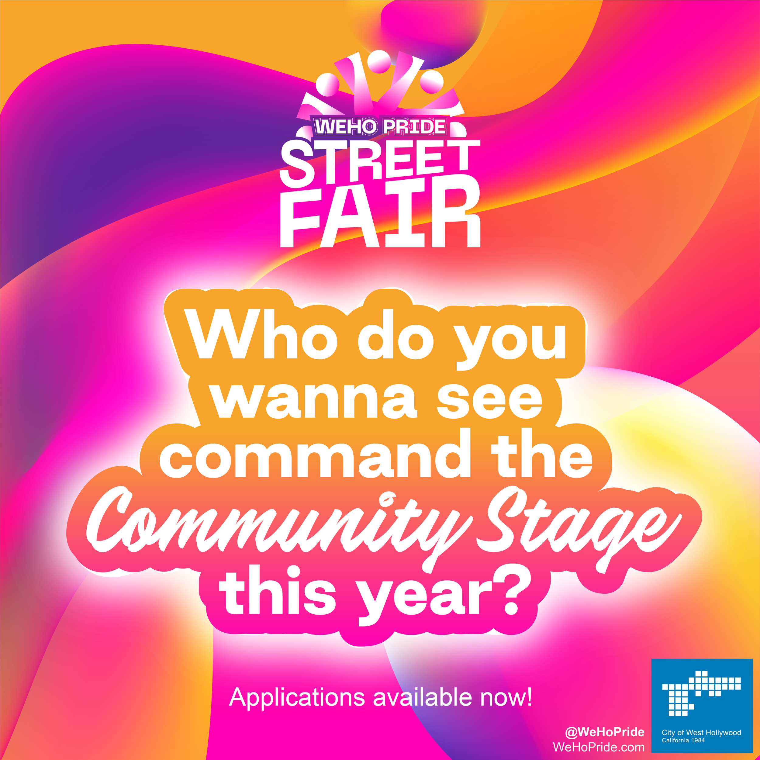

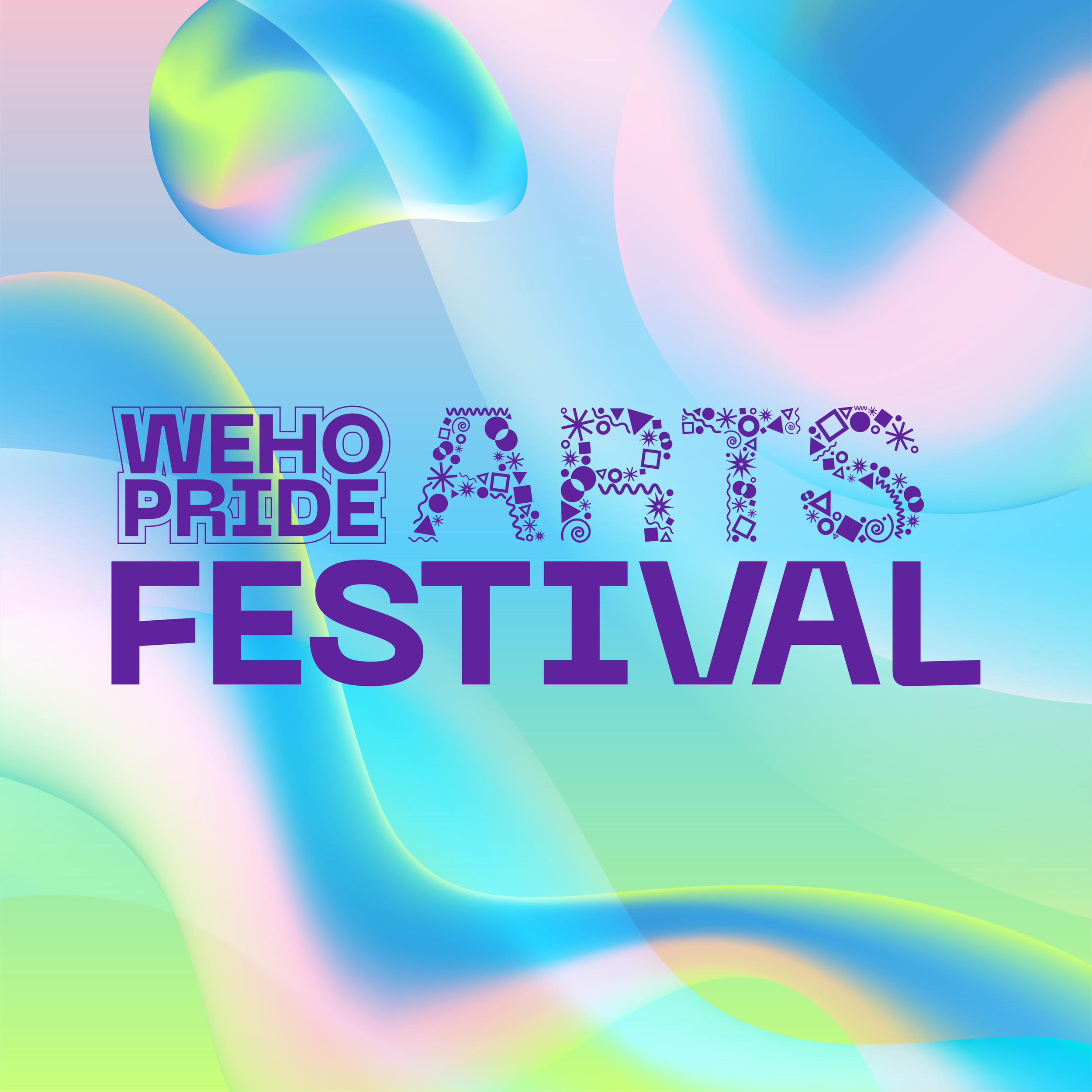
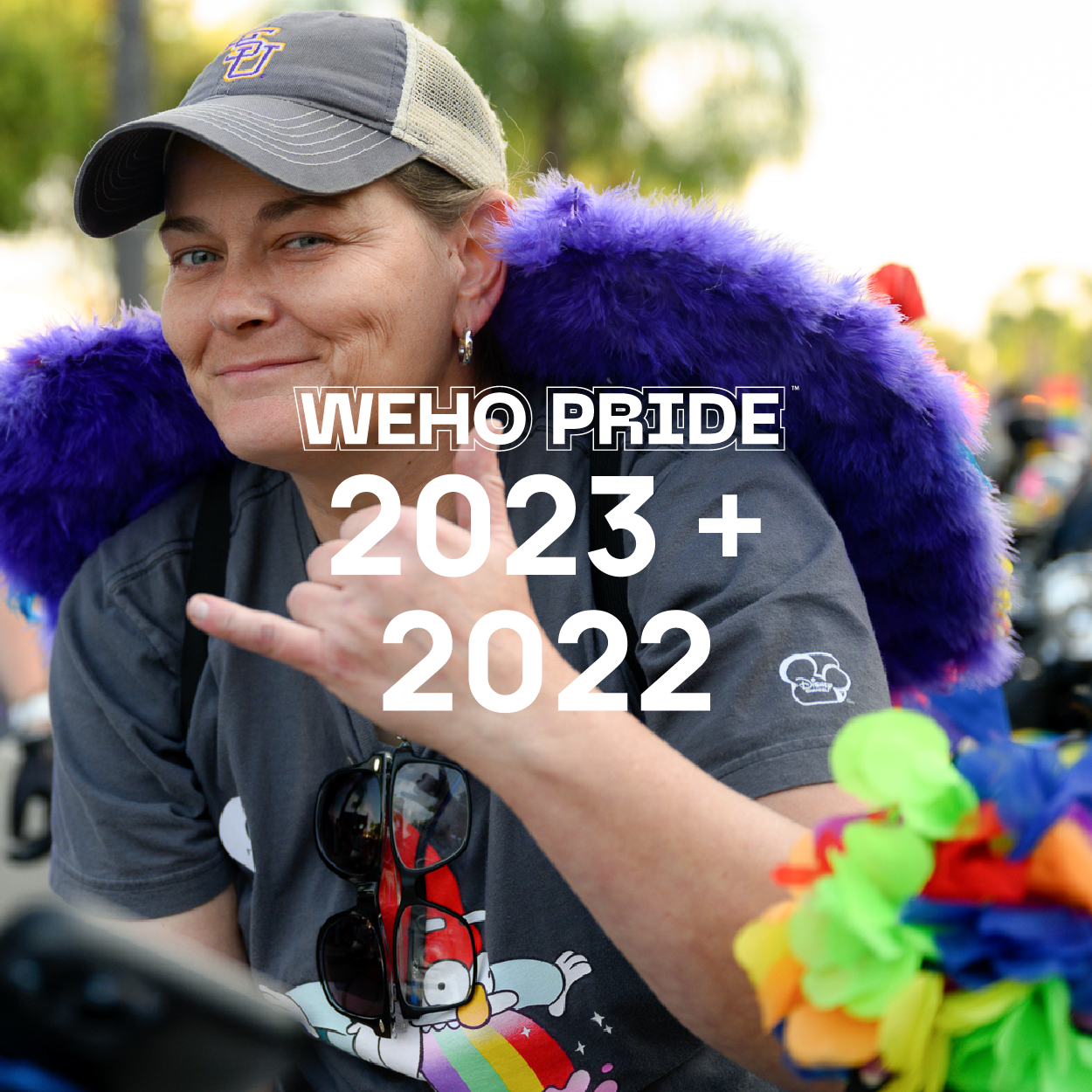
WeHo Pride
(Phase 1: 2023 + 2022)
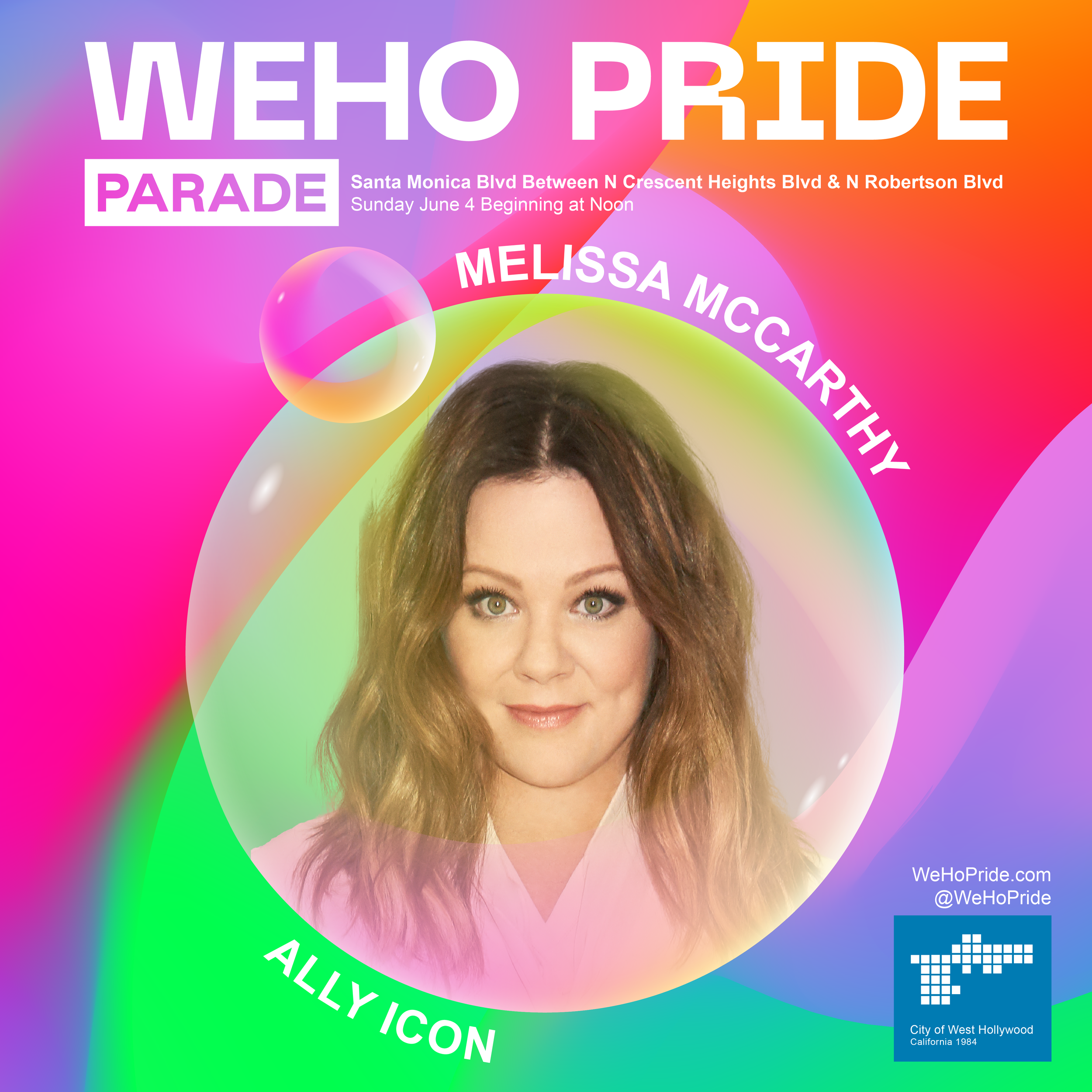
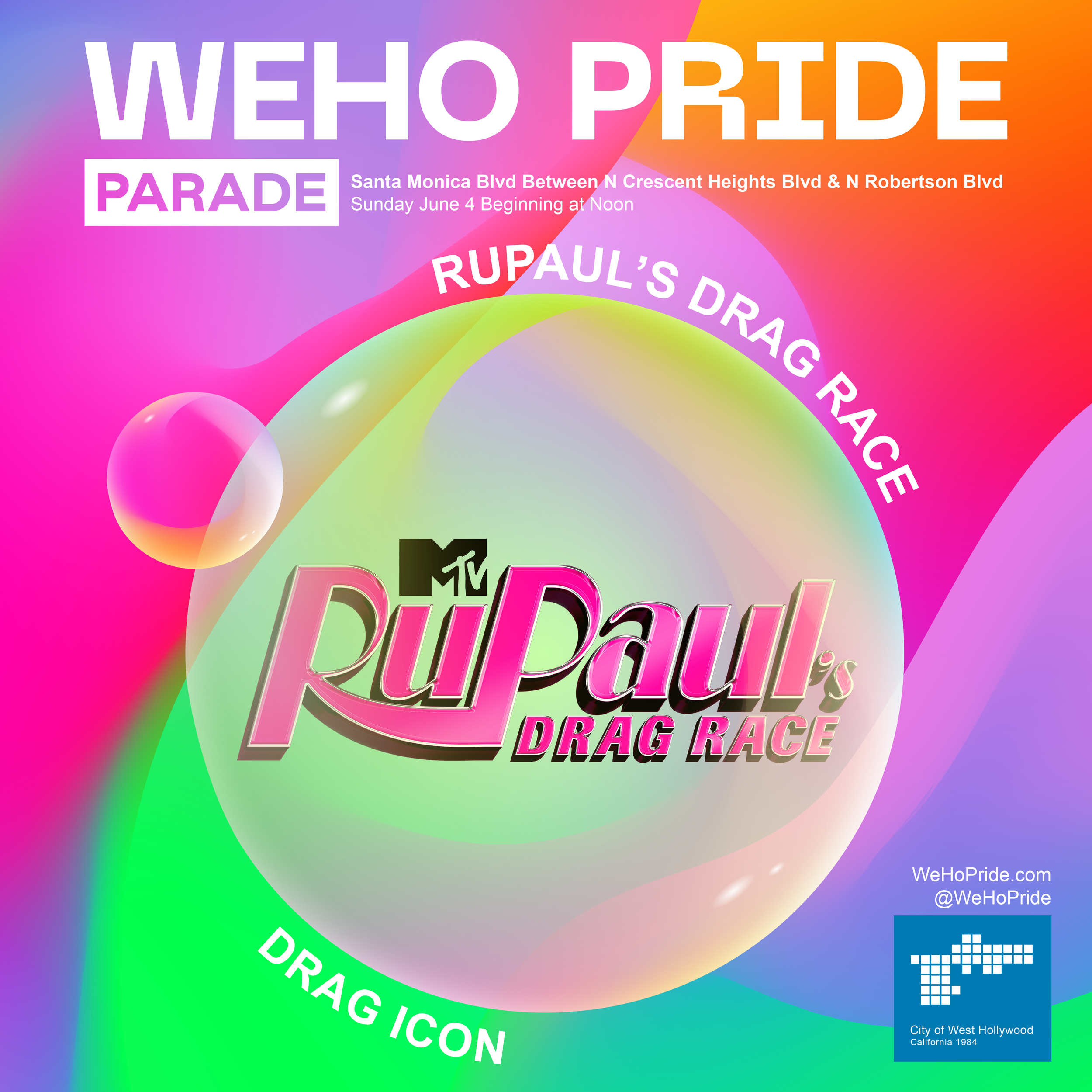
Conceived as part of our fluid and ever-evolving understanding of gender identity + sexual expression, the WeHo Pride brand combines rainbow colors to create beauty in the space between traditional binaries. The gradient tapestry of colors and fluid shapes work together to create a vibrant celebration of Pride's unique diversity.